

The Prada Palette
A deep dive into my favorite color story

I’ve always had a deep, almost sentimental love for Prada. It was the first designer I ever really became obsessed with, the first one that felt personal. Just after high school when I was working in a boutique children’s store, I saved up to buy my first vintage designer bag. It was a medium size signature Prada green nylon purse. It was the first designer thing I ever owned, and it triggered something in me. After that, Prada became a kind of blueprint: for my wardrobe, for the silhouettes I gravitated toward, for how I understood fashion in general.
So much of what I know about getting dressed, about proportion, about restraint, about tension between masculine and feminine, comes from watching Prada collections. I love the utilitarianism of it, the way nylon or Gore-Tex can feel as important as silk. There’s always this slightly tomboyish undercurrent, a kind of off-hand masculinity that’s then gently re-shaped into something undeniably feminine. It’s never saccharine and never overly pretty. It’s sharp, considered and a little strange which is exactly what makes it beautiful.
But more than anything, what I keep coming back to is the color.
Miuccia Prada is, to me, a master of color in a way that feels almost psychological. My wardrobe used to be almost entirely black and white— maybe some military green, some beige, some gray if I was feeling adventurous. But Prada’s colors don’t feel like “color” in the intimidating sense. They feel neutral, even when they’re technically bright. There’s something about the way she tones them down, or pairs them with something awkward, or renders them in nylon or wool, that makes them feel wearable, lived-in, and almost intellectual.
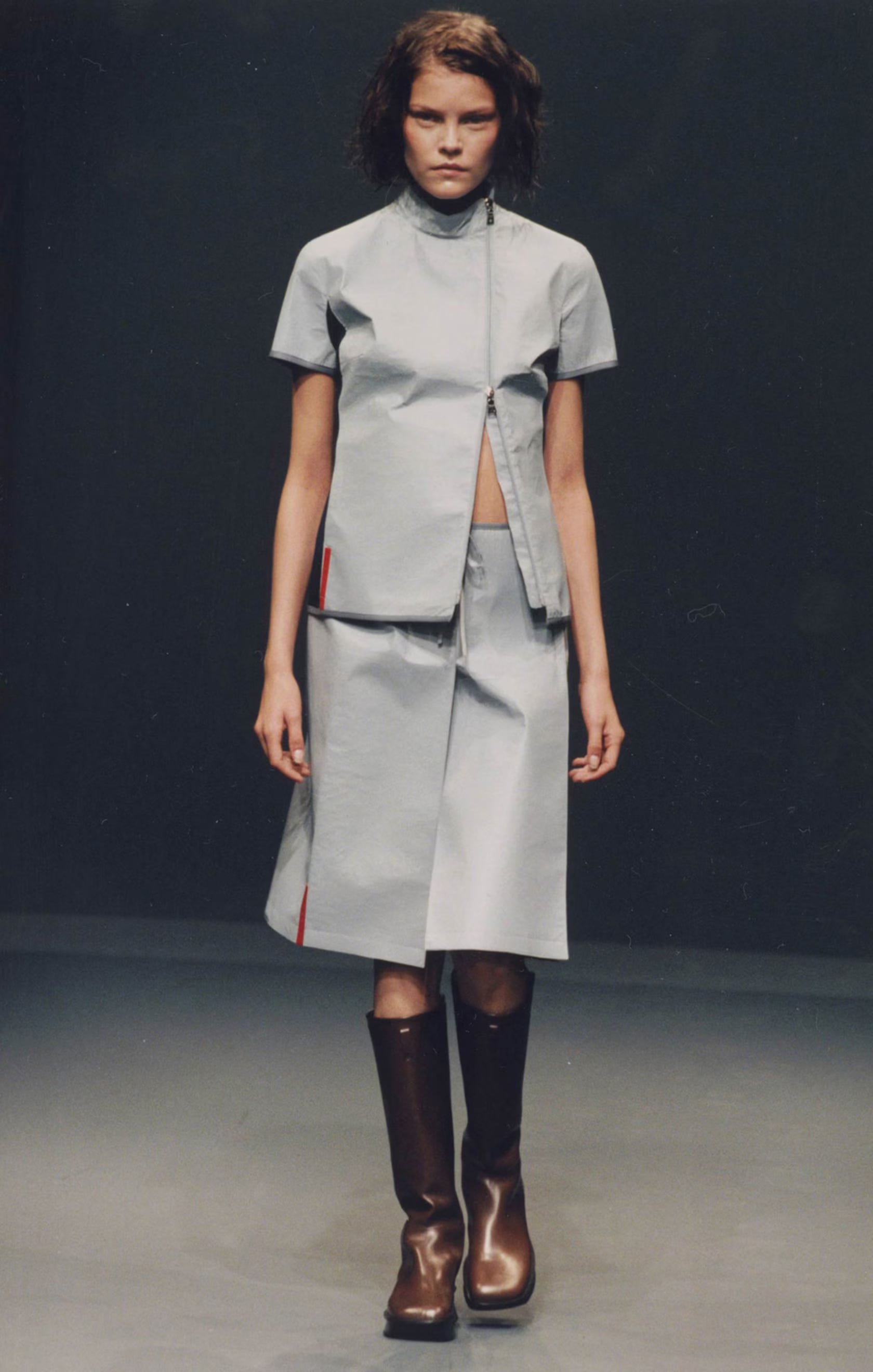
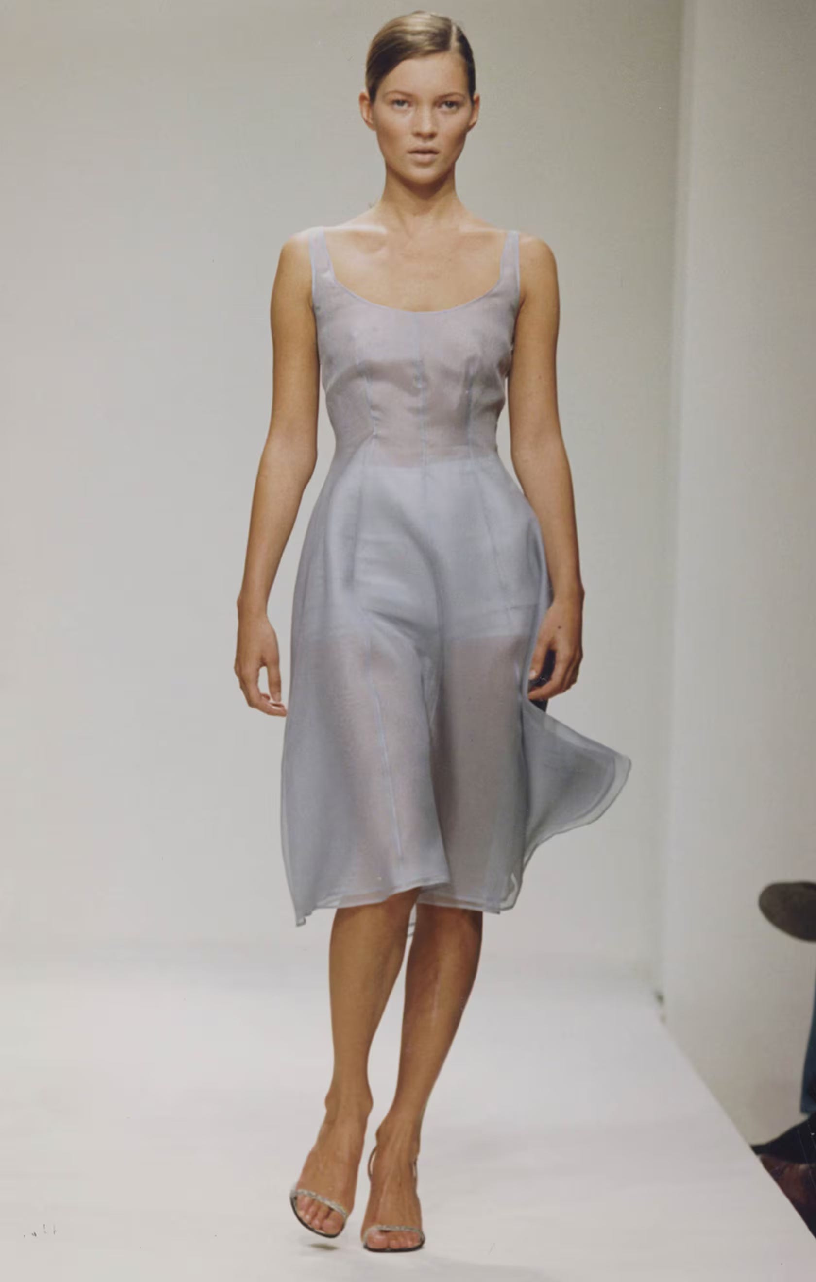
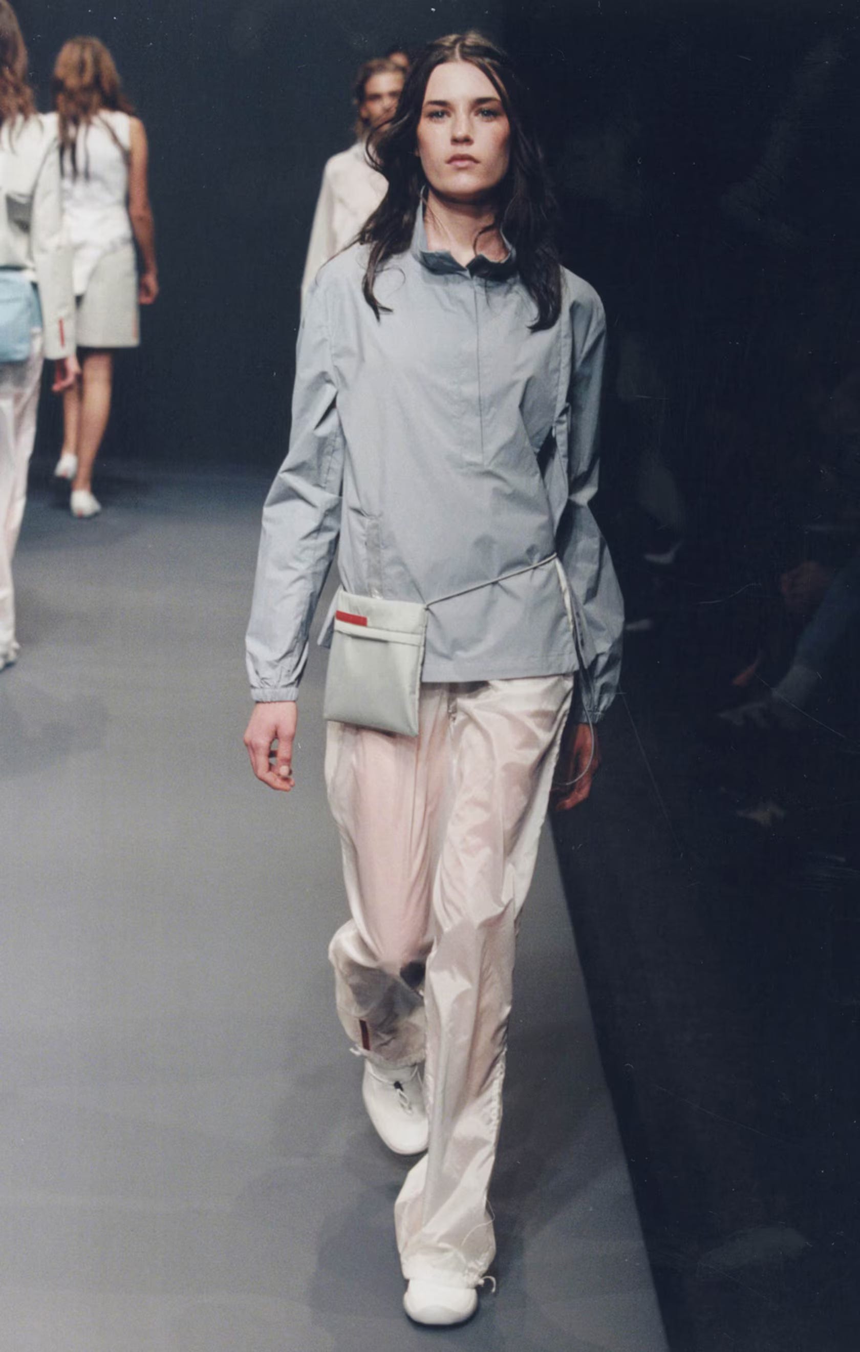
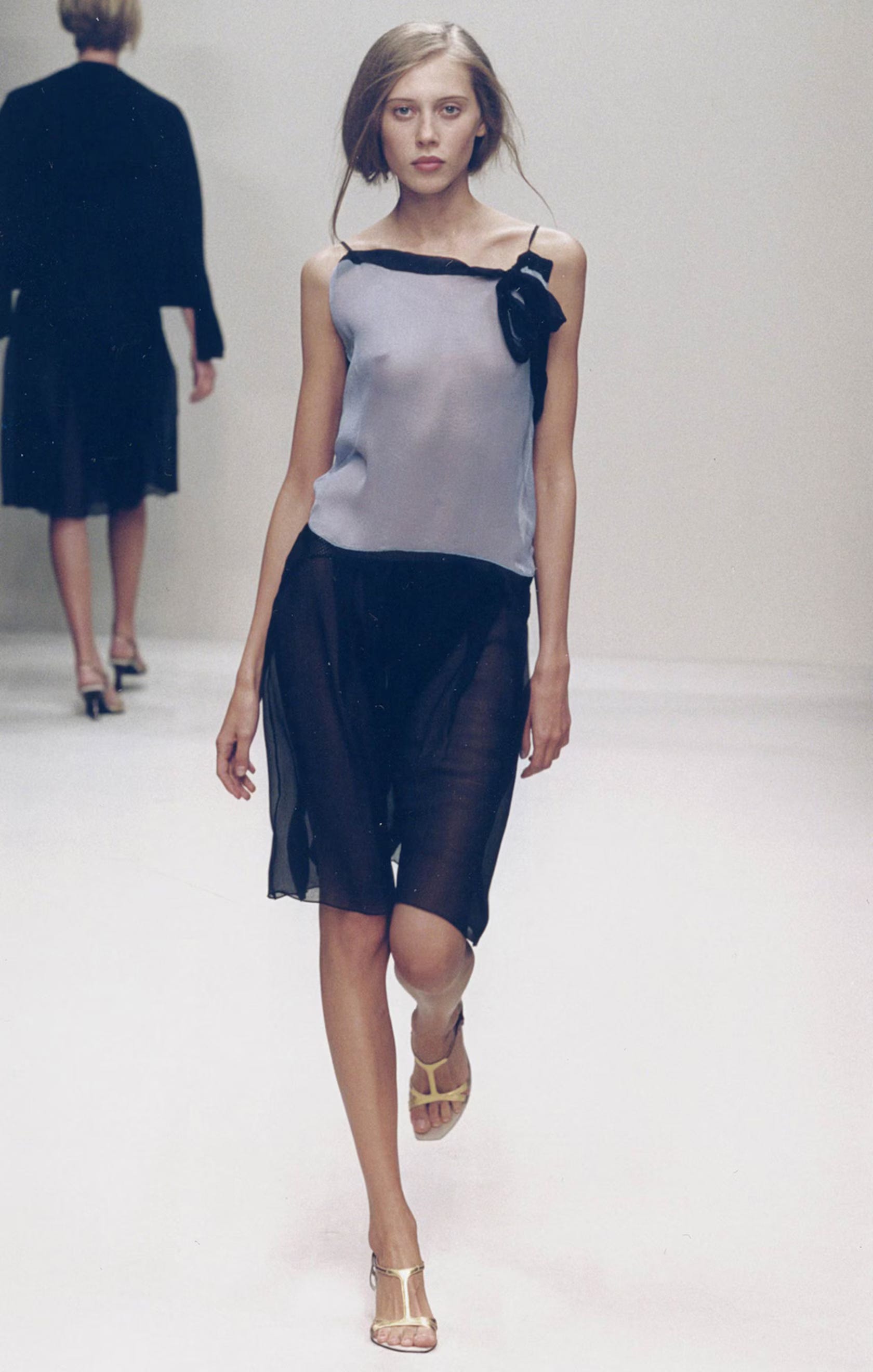
Prada Blue
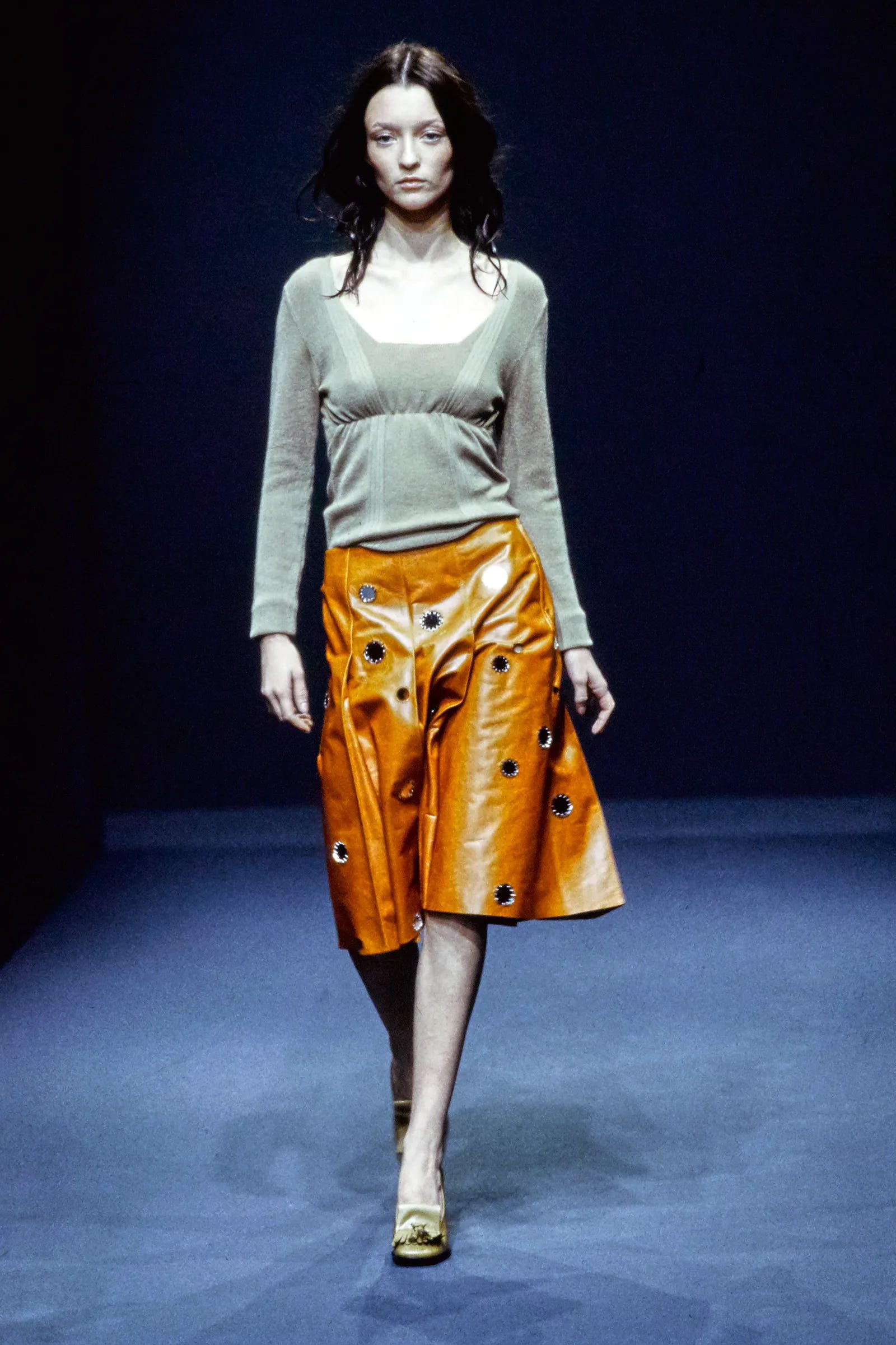
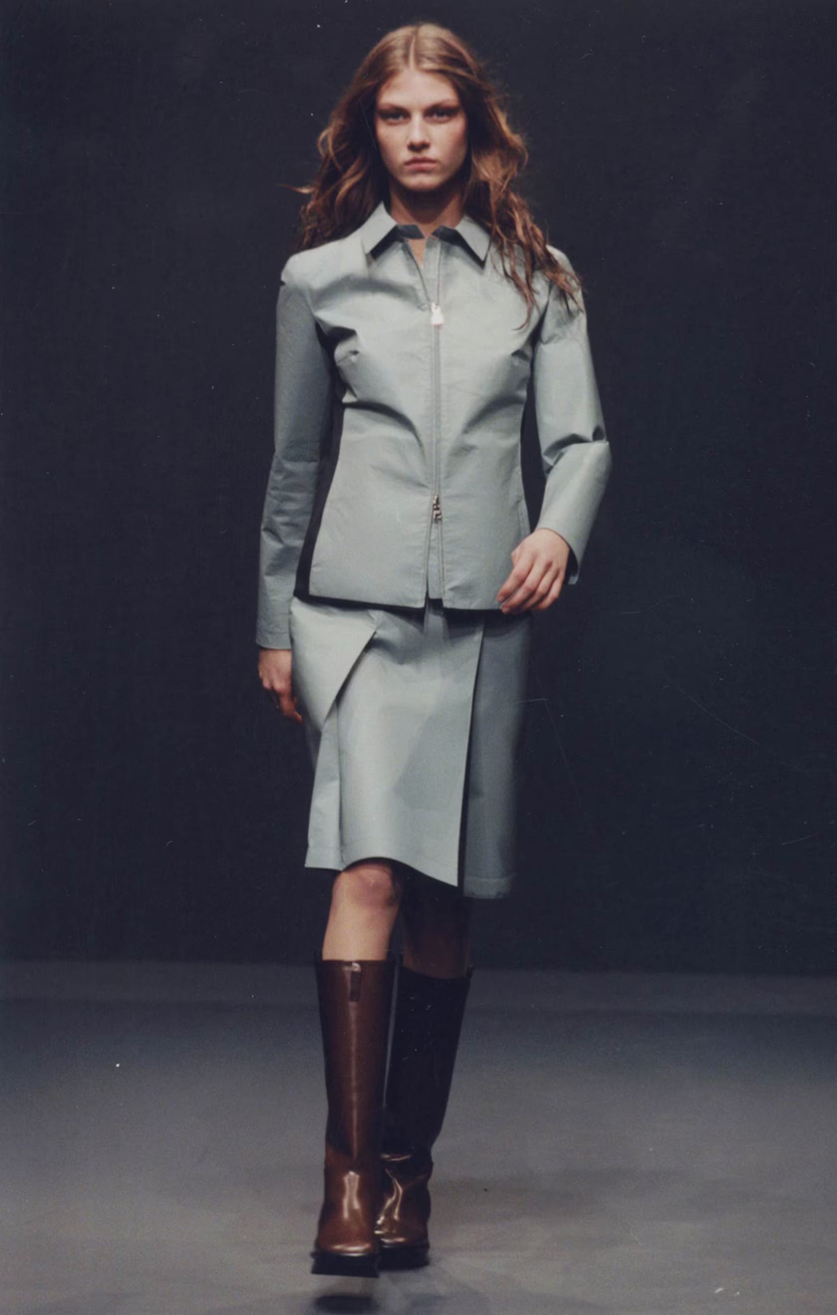
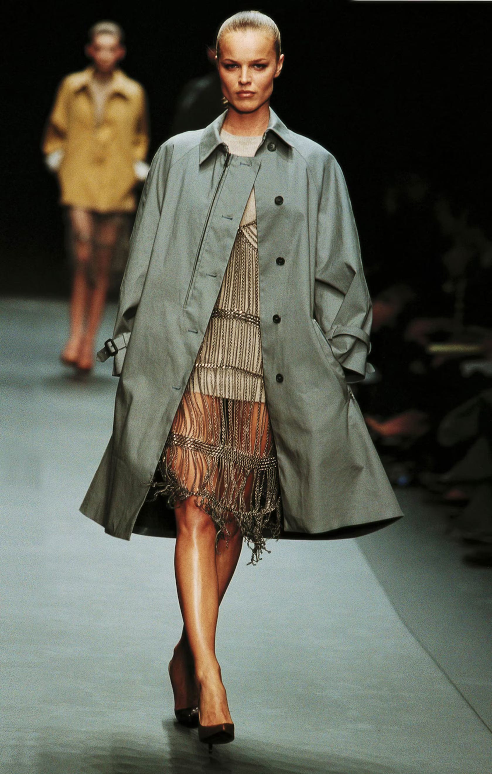
There’s a certain pale, grayish baby blue that feels completely synonymous with Prada. It’s soft but not sweet, almost institutional, like a school uniform that’s been washed a hundred times. In nylon especially, it becomes this perfect, slightly sterile, nostalgic shade. You see it on boxy jackets, crisp shirts, little skirts, and it just reads instantly as Prada. It’s not a loud color, but it has presence. It’s chic in a very quiet, confident way.
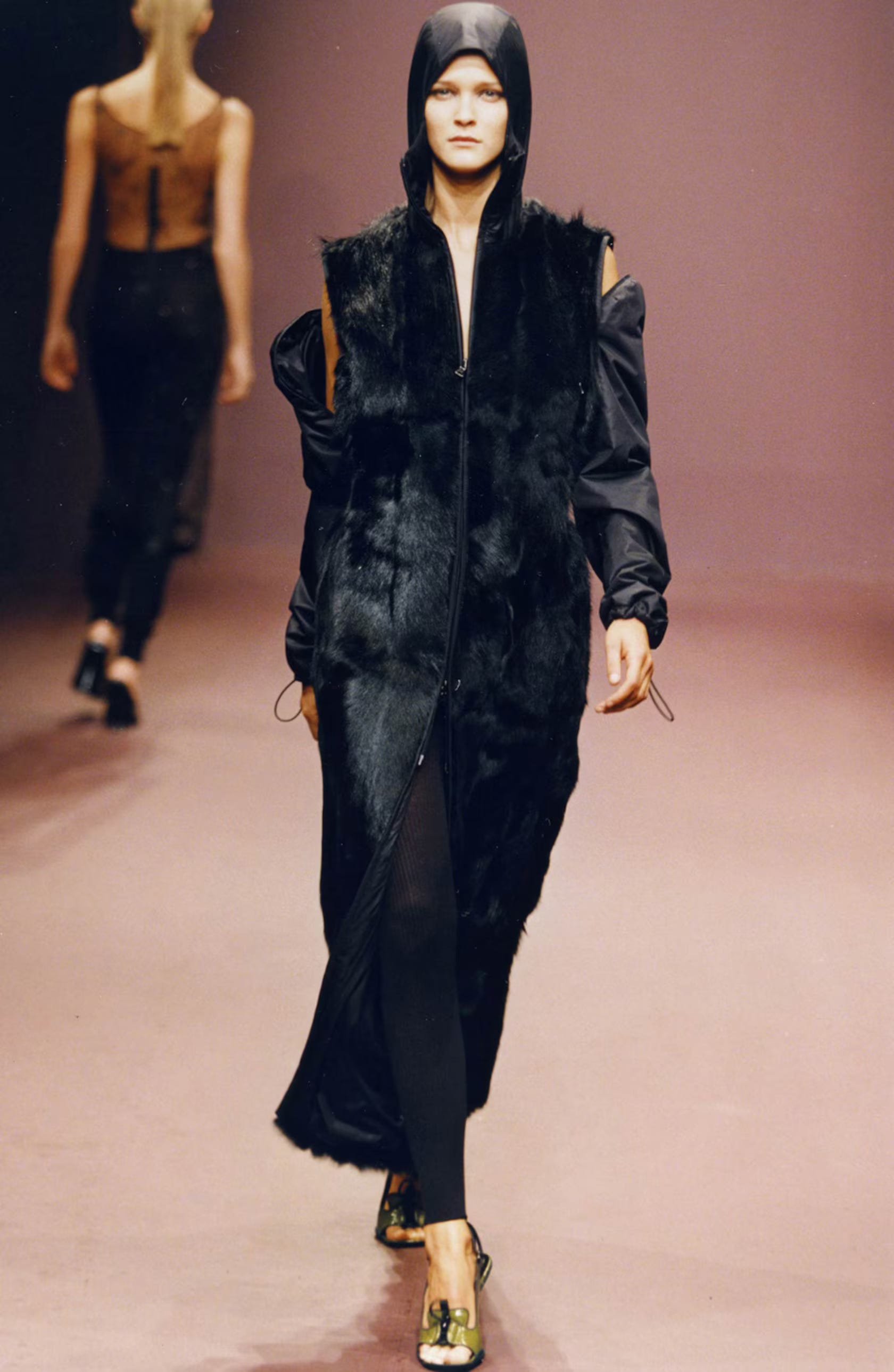
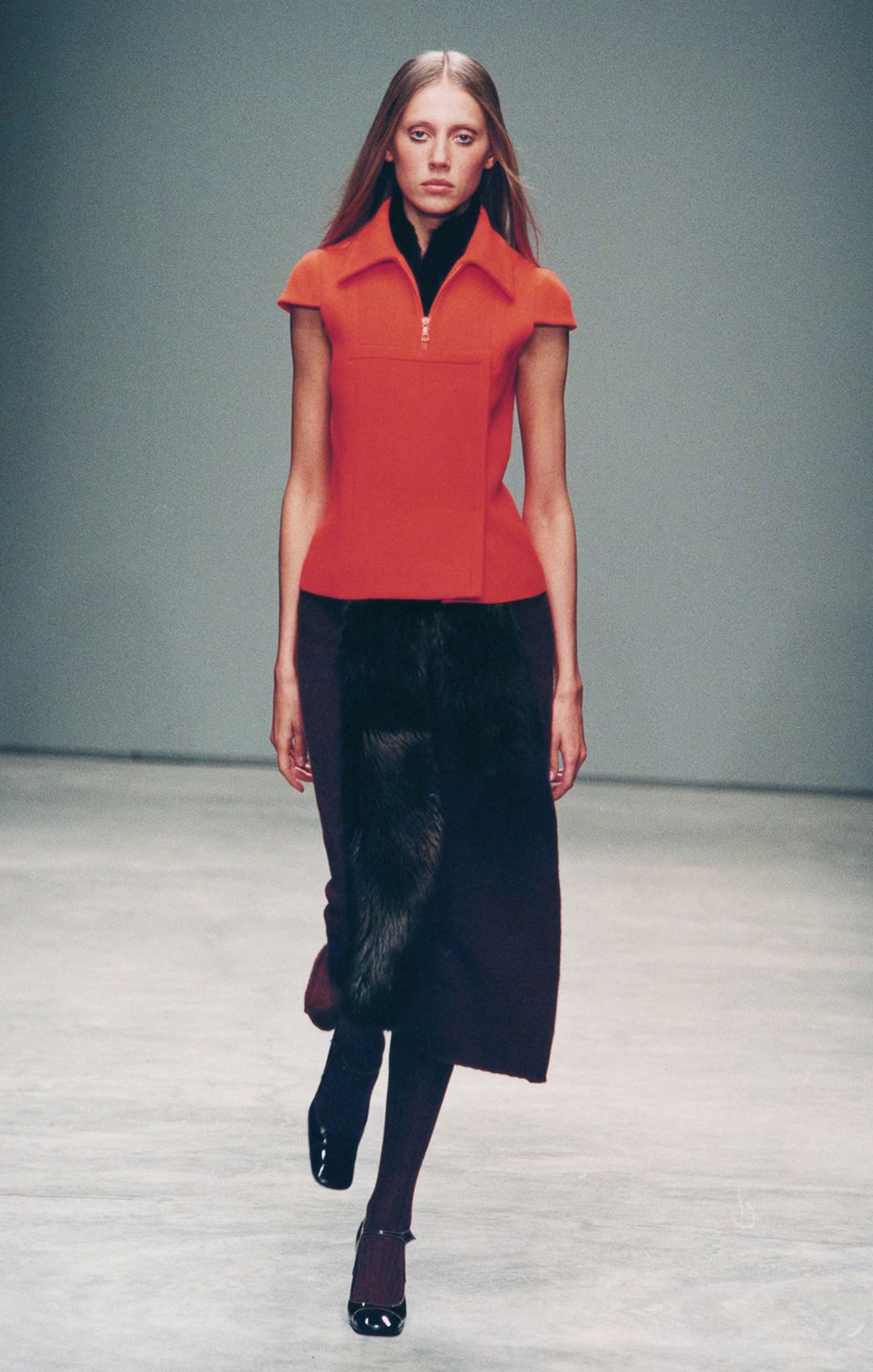
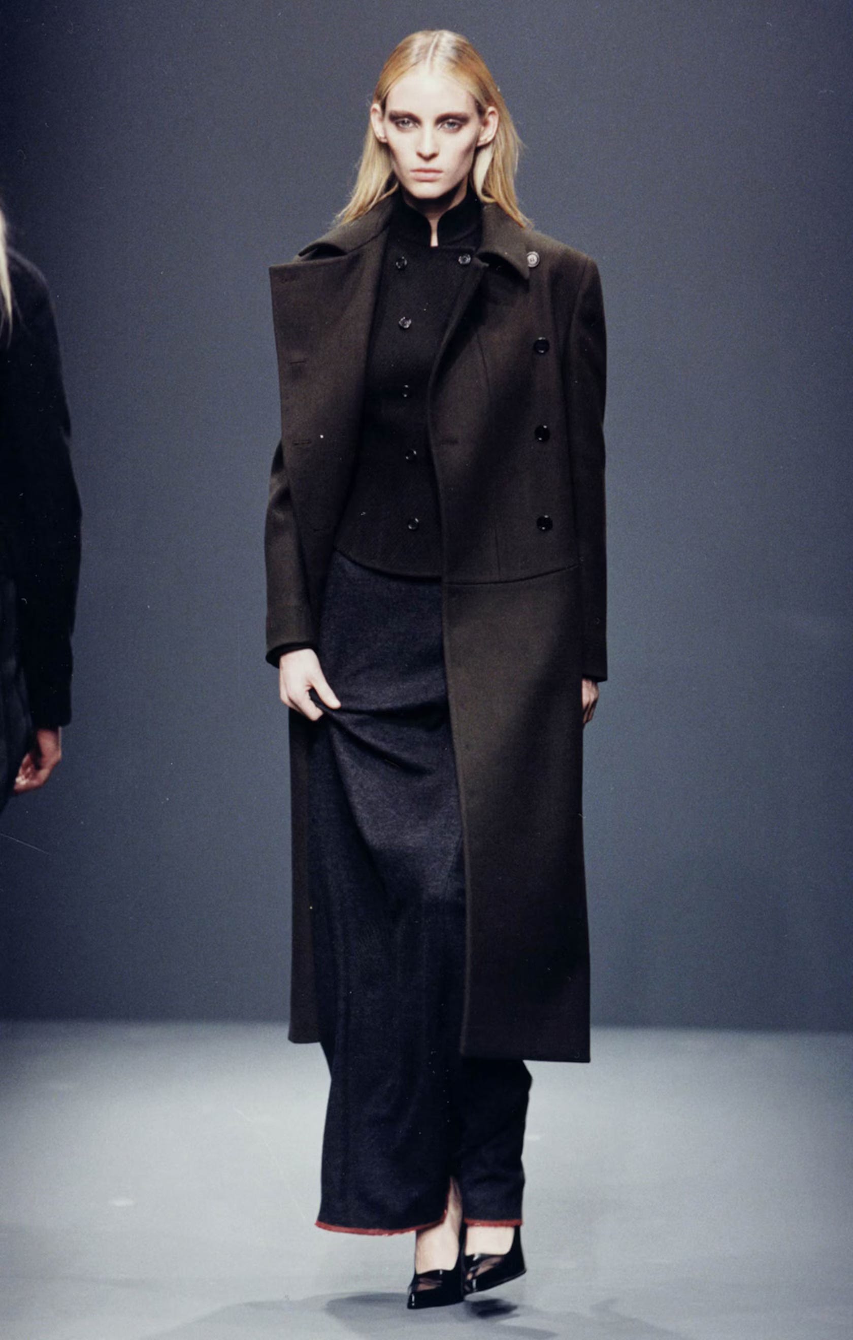
Black
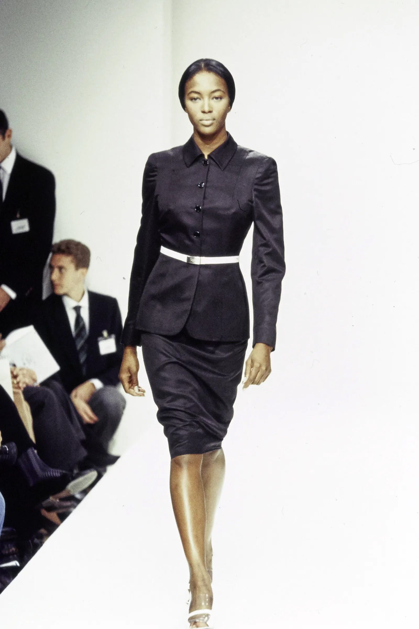
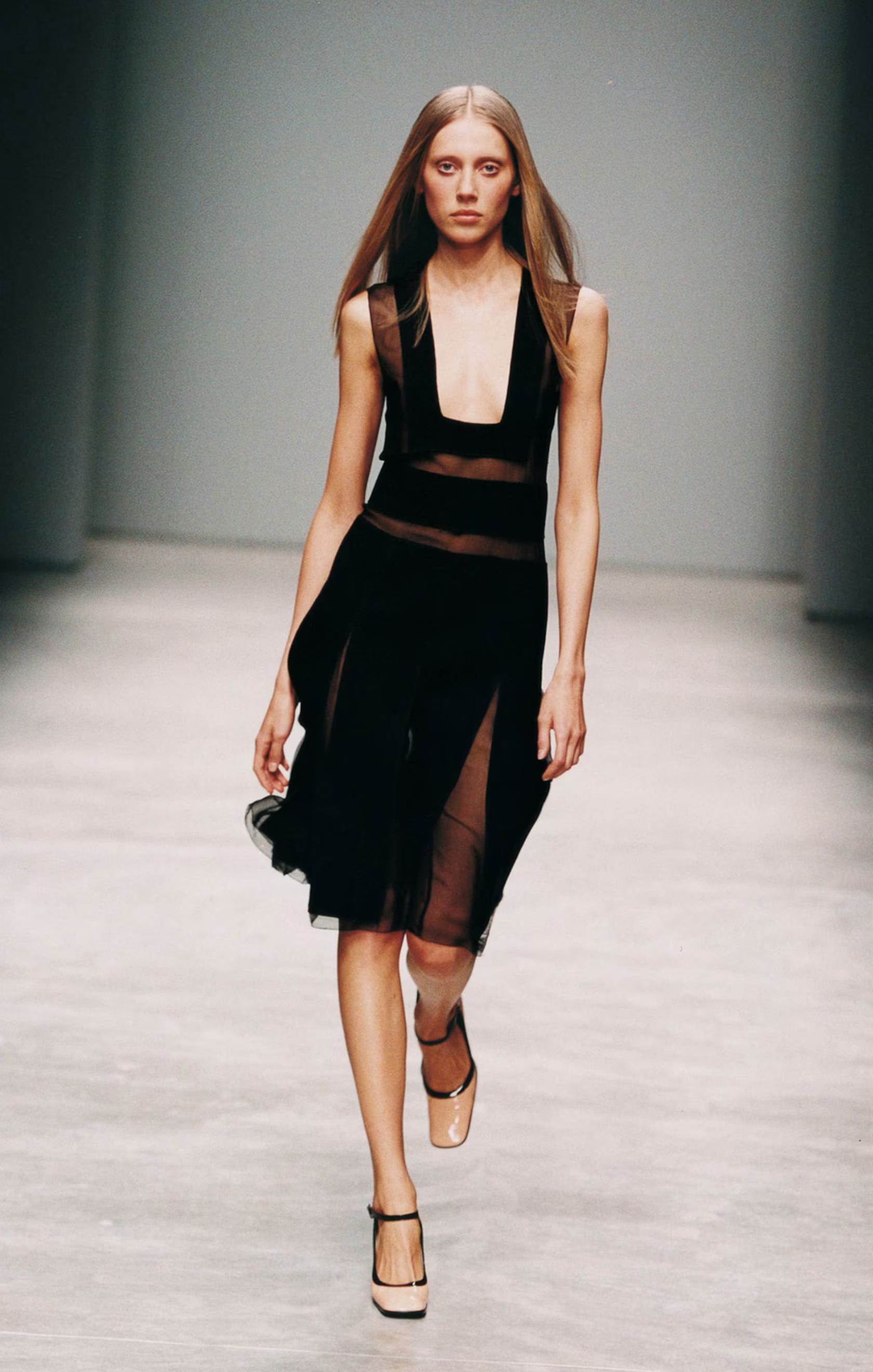
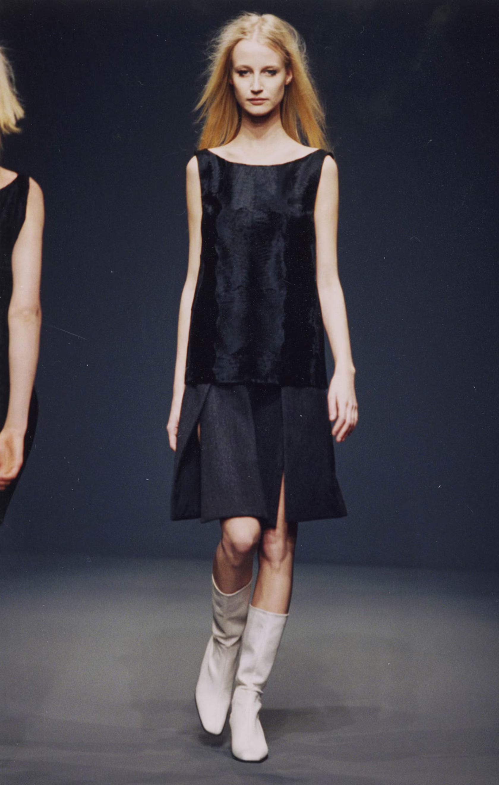
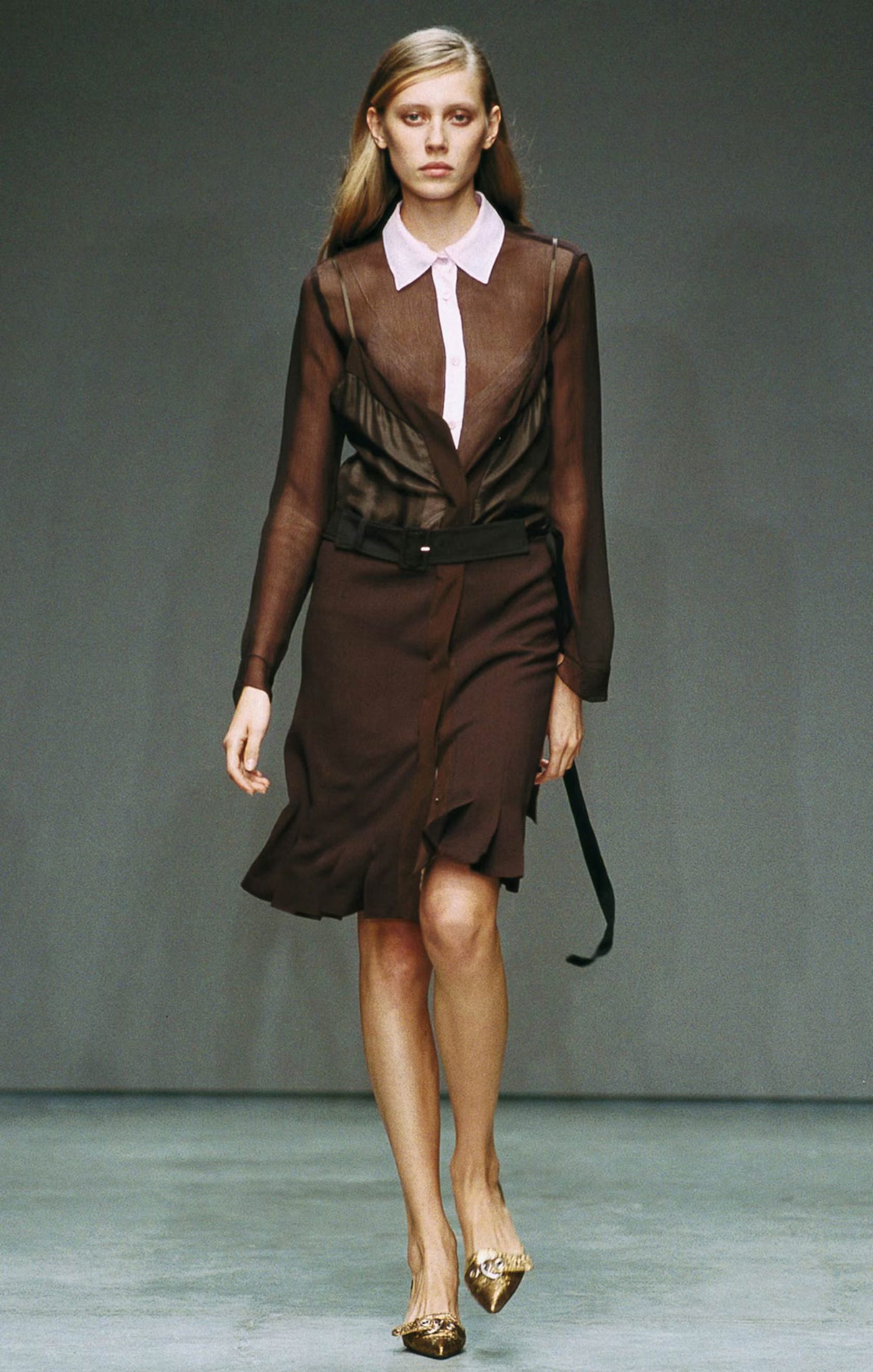
Of course there’s black, but even Prada’s black feels specific. It’s not always glossy or dramatic; sometimes it’s matte nylon, sometimes it’s wool, sometimes it’s a slightly stiff cotton. It’s utilitarian, almost industrial. Prada black doesn’t scream seduction; it suggests discipline. It’s the black of uniforms, work, and seriousness. And because of that, it feels stronger, more intellectual and more interesting.
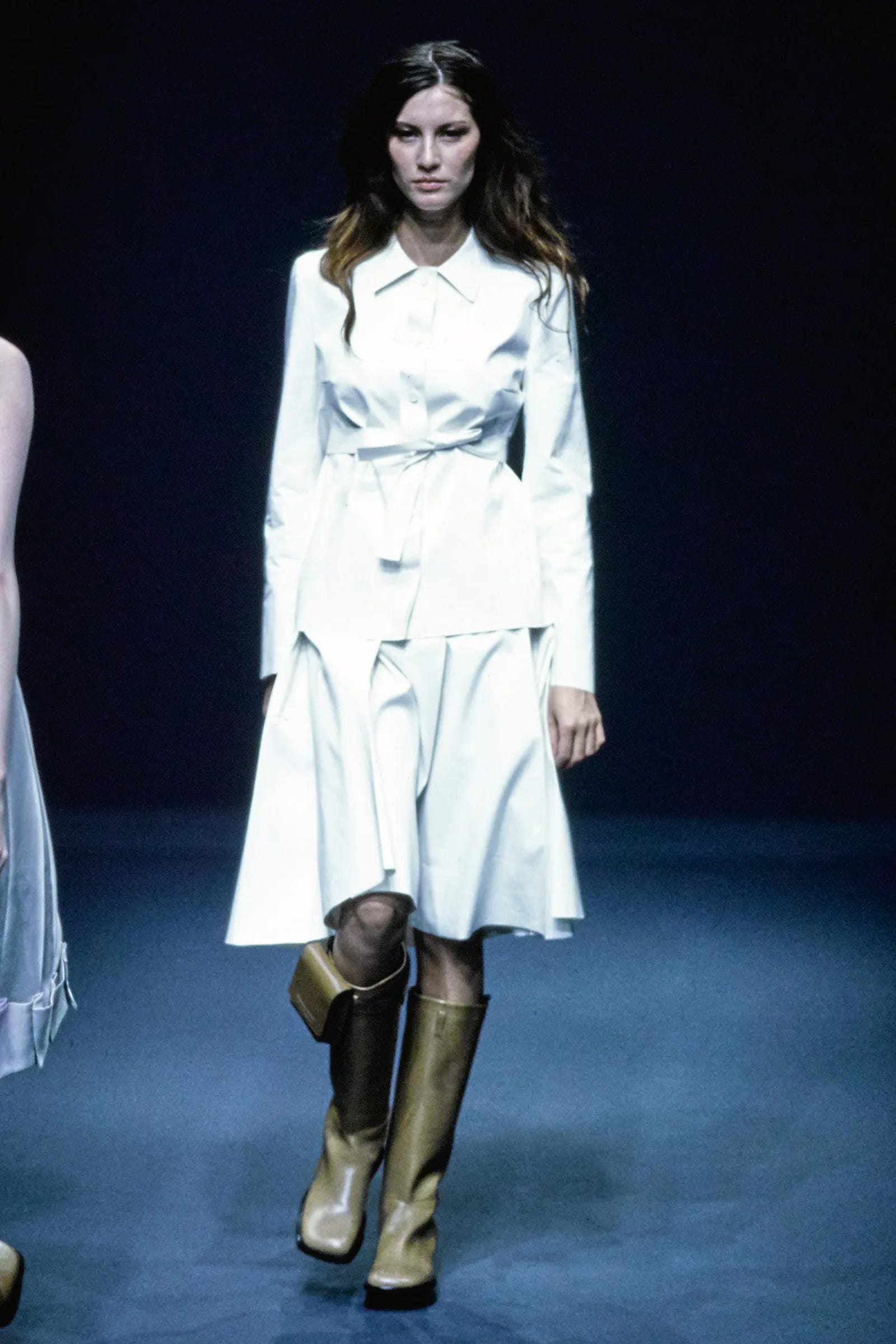
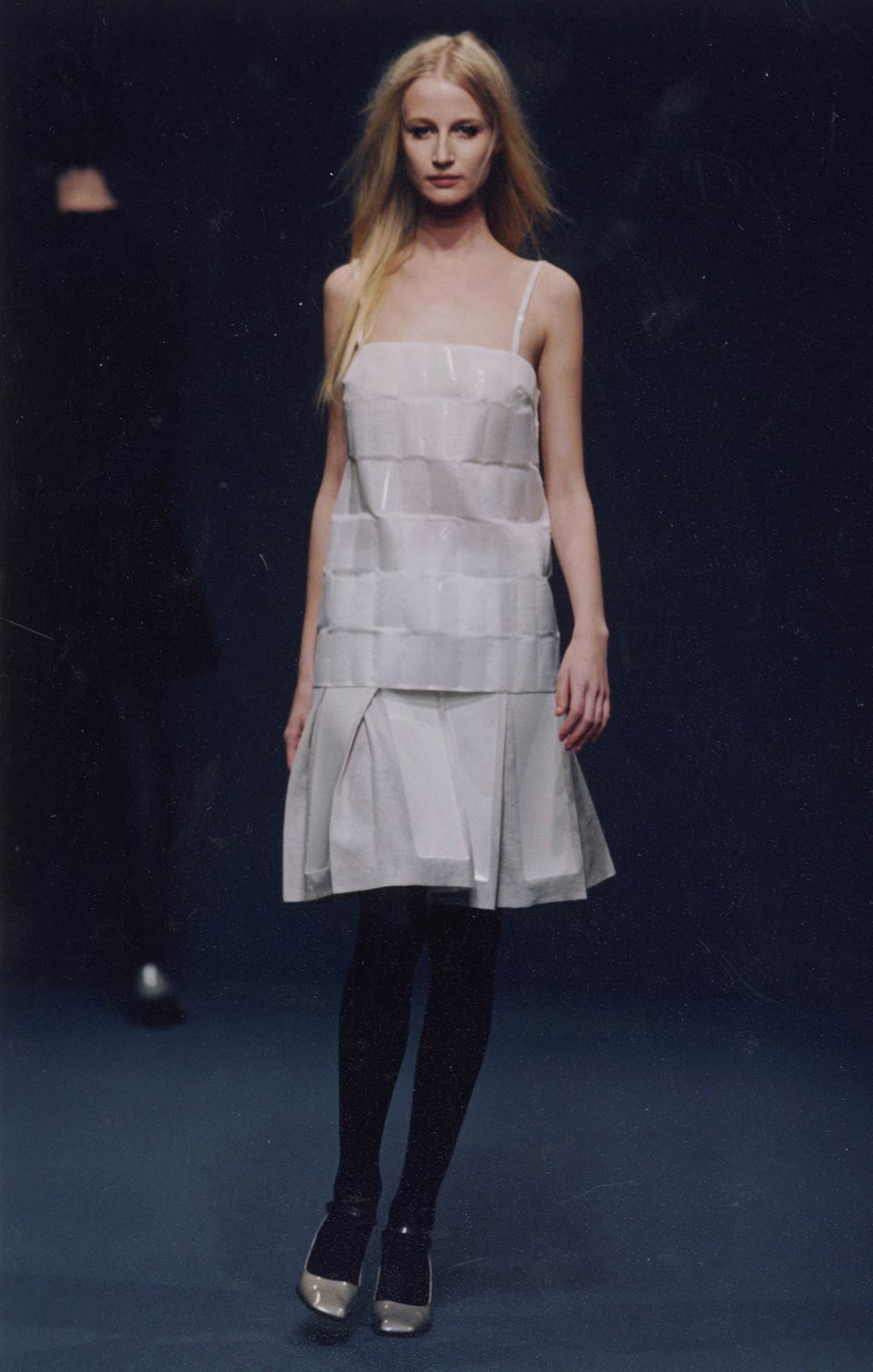
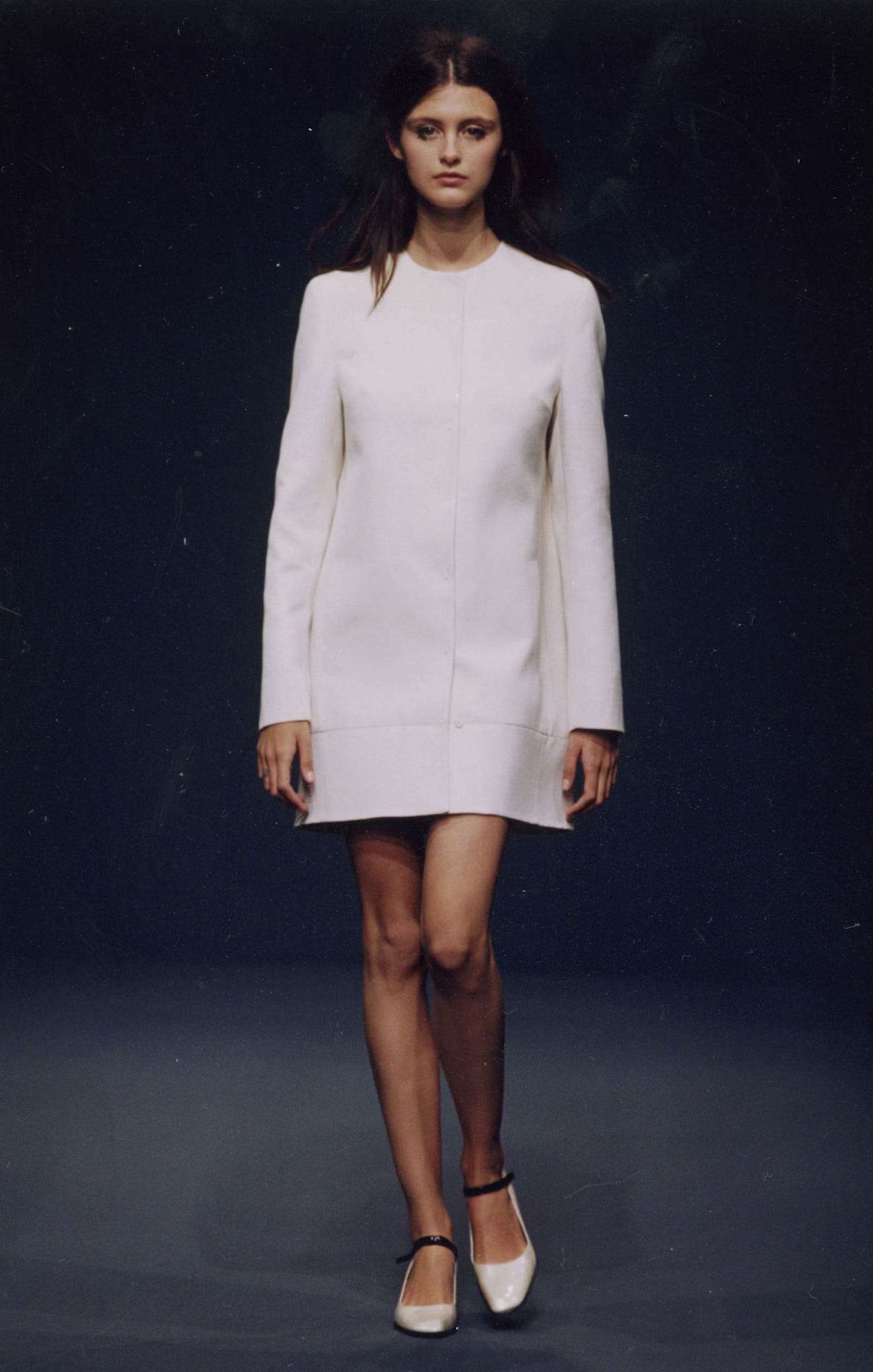
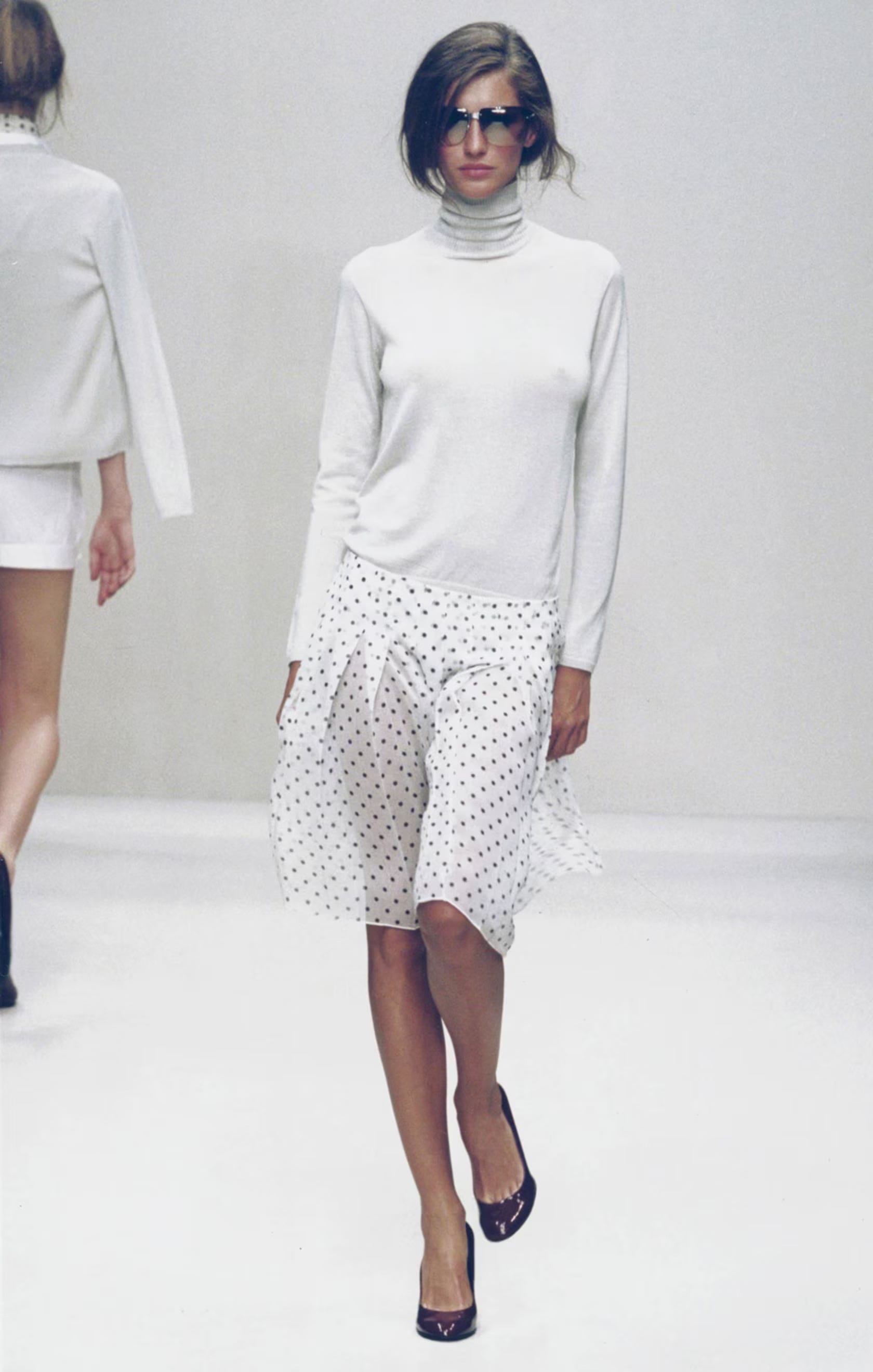
White
Prada white is never precious. It’s not bridal or delicate. It’s often slightly stark, almost clinical, like a lab coat or a chef’s jacket. On a crisp cotton shirt or a structured skirt, it feels fresh but also a little severe. It’s the kind of white that makes you think of function before romance, which is exactly what makes it feel modern.
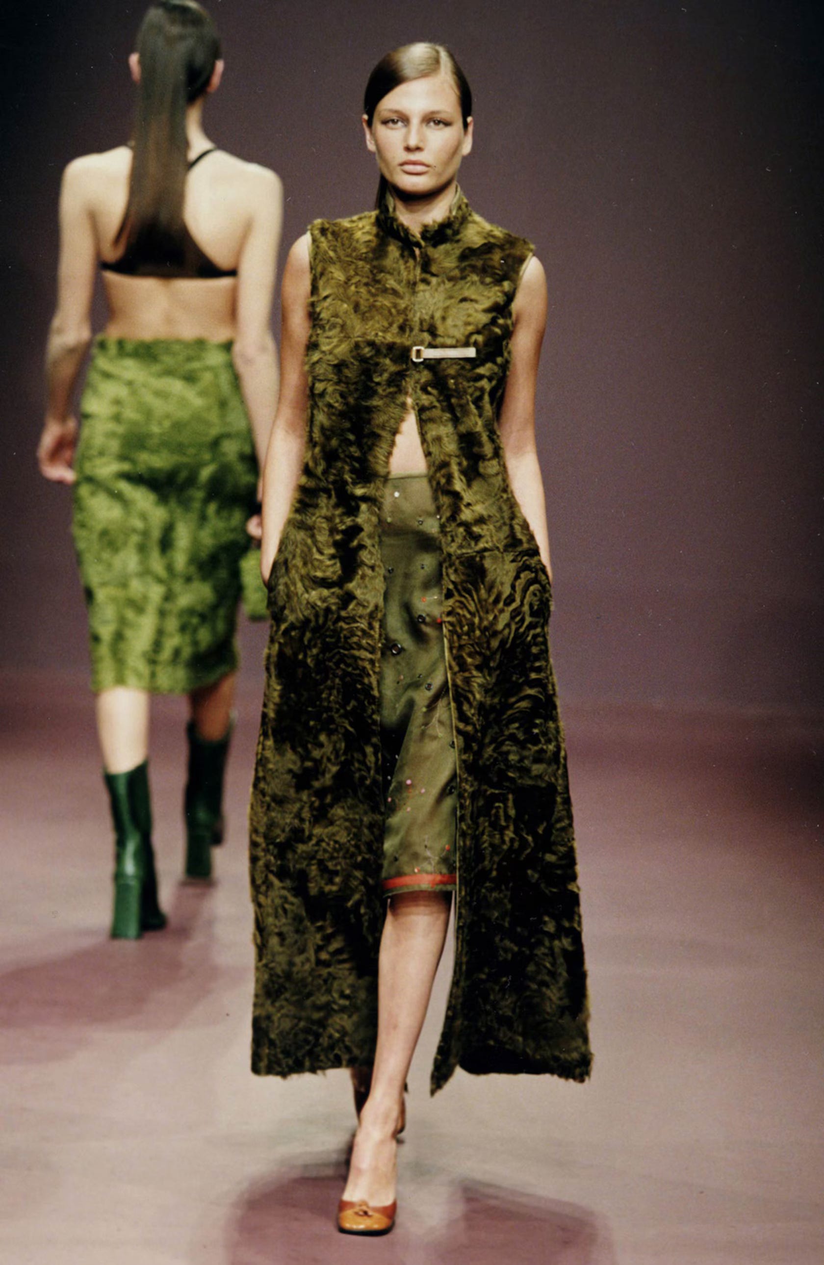
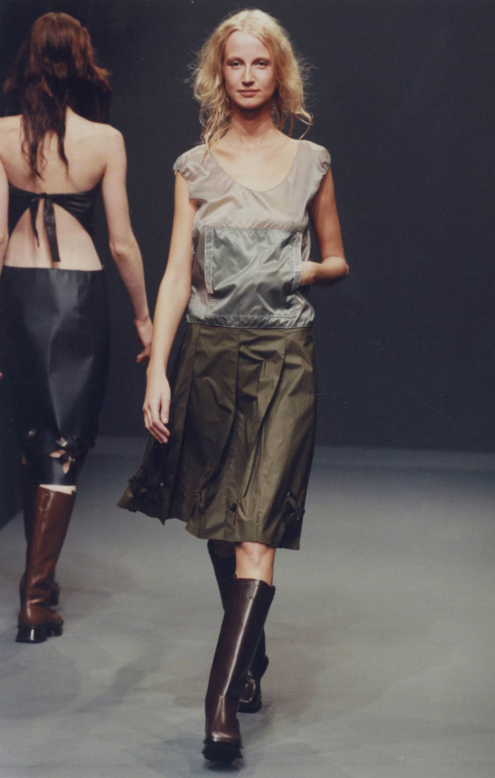
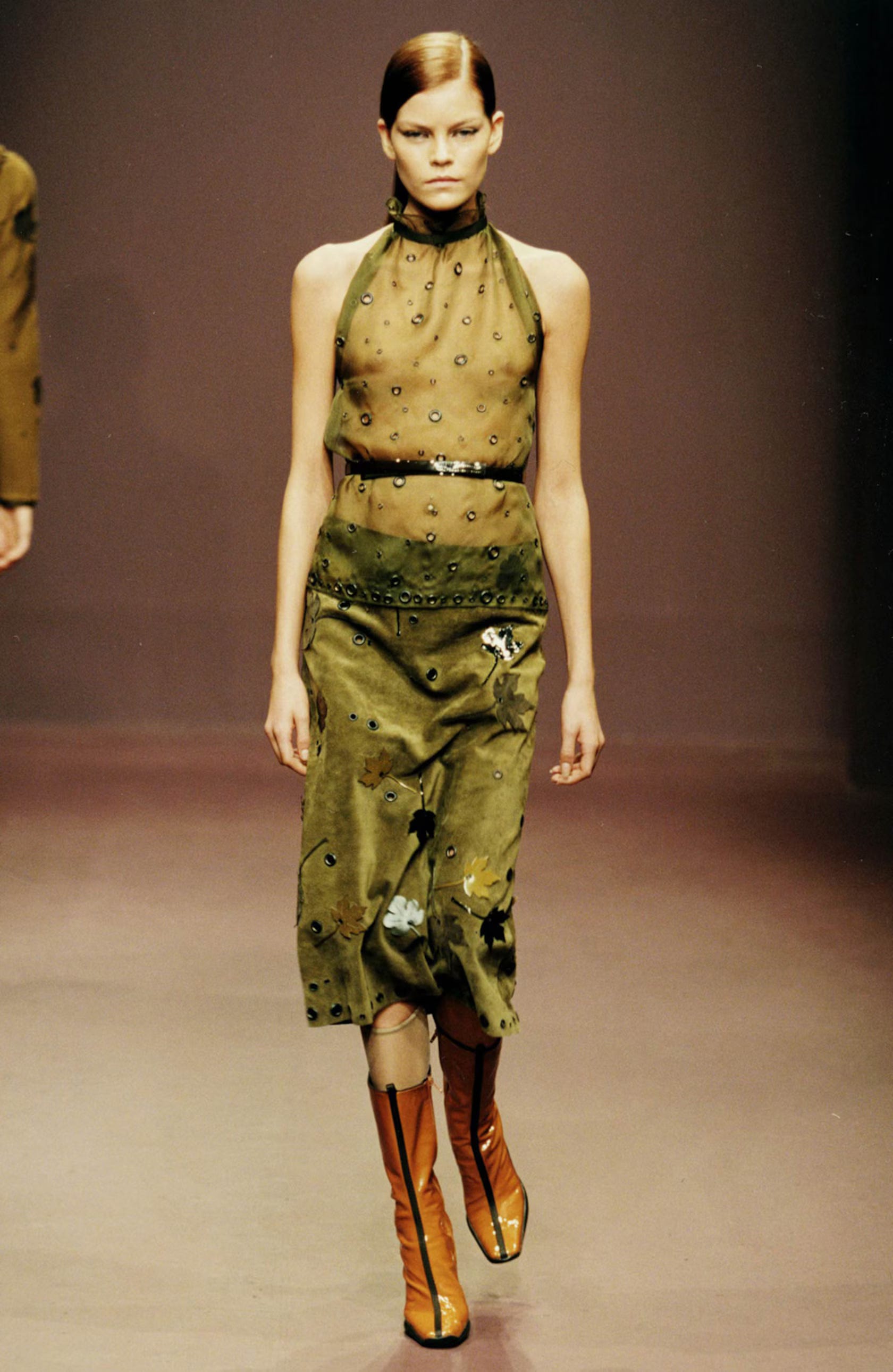
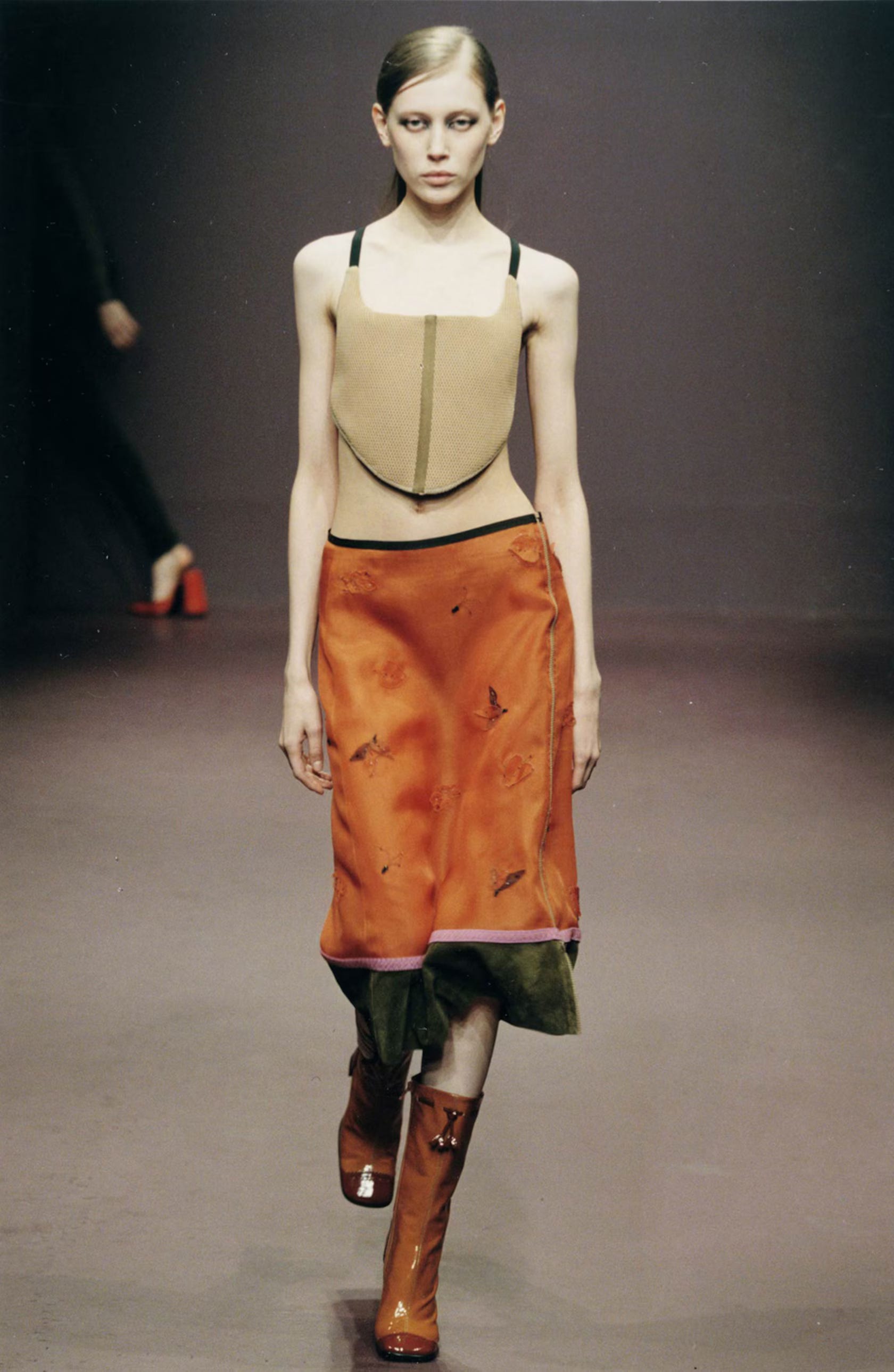
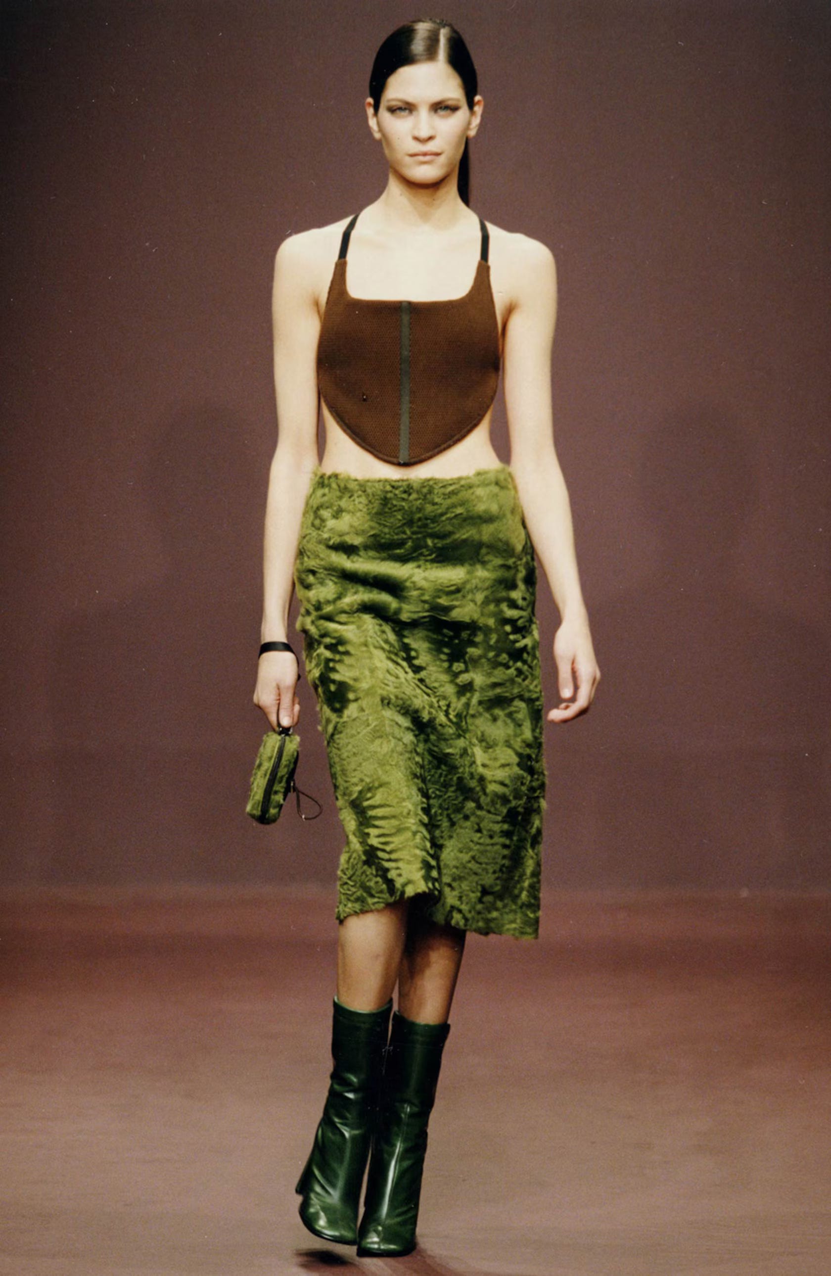
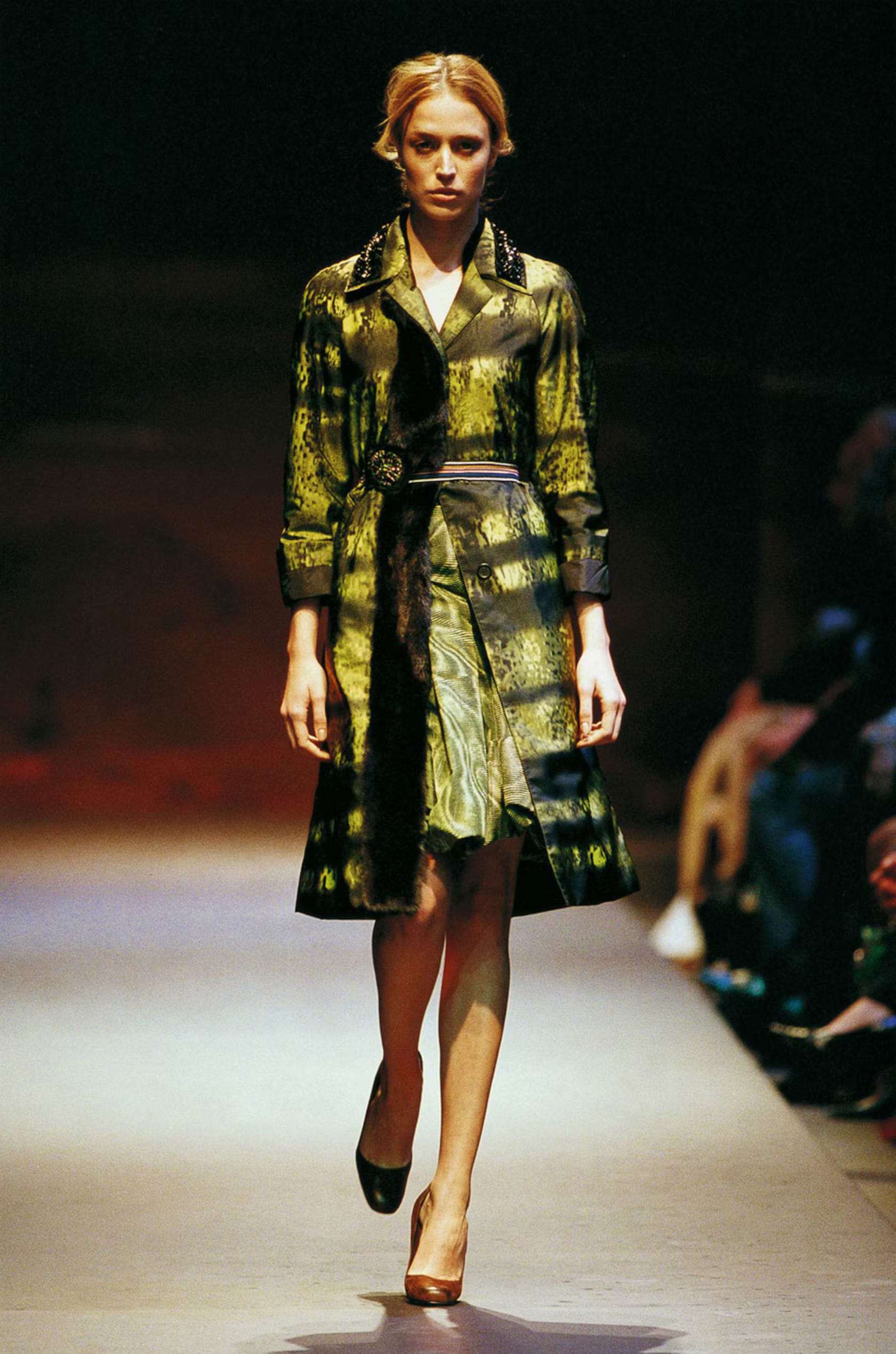
Olive Green
Olive green feels like the center of Prada’s utilitarian side. It’s the color of uniforms, canvas field jackets, and practical little nylon pouches. But in Prada’s hands, it never feels purely functional. There’s always a slight refinement to it, whether it’s rendered in a crisp cotton poplin, a slick nylon, or a perfectly weighted wool. It sits somewhere between masculine and neutral, earthy and urban, and it pairs beautifully with almost everything in the Prada palette—charcoal, brown, pale blue, even that strange mustard.
Mustard / Okra
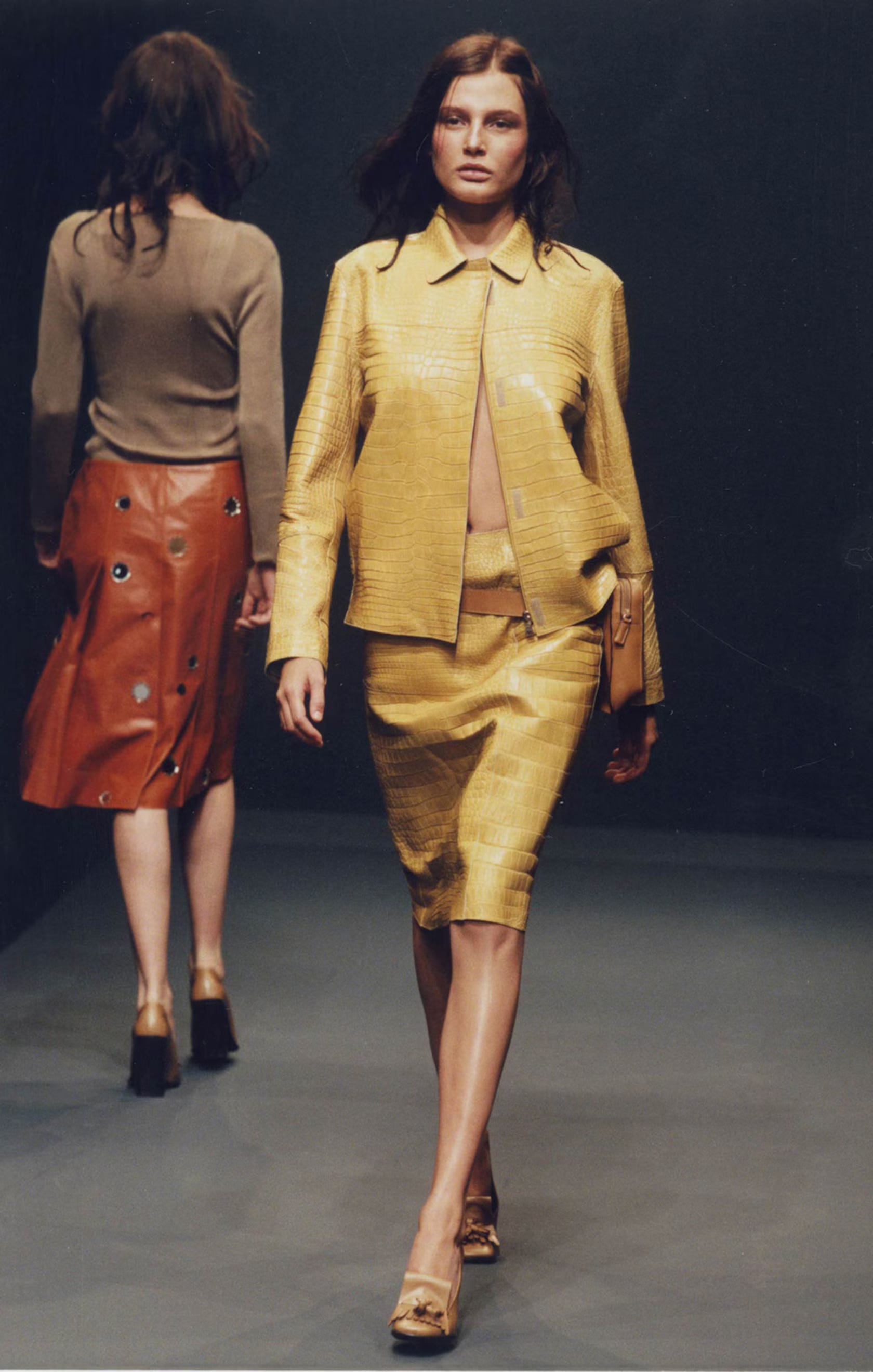
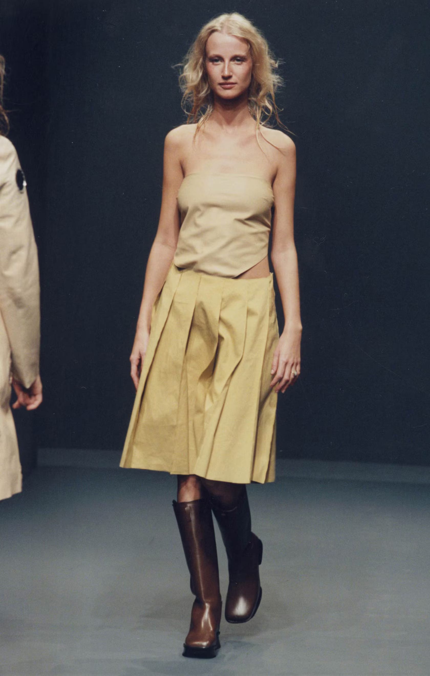
Prada’s yellow is a strange, beautiful mustard—almost an okra. It’s not a cheerful sunshine yellow. It’s murky, complex, and a little retro. It shows up in knits, skirts, odd little accessories, and it always feels unexpected. It’s the kind of color you wouldn’t necessarily pick on your own, but when Prada uses it, it suddenly feels essential.
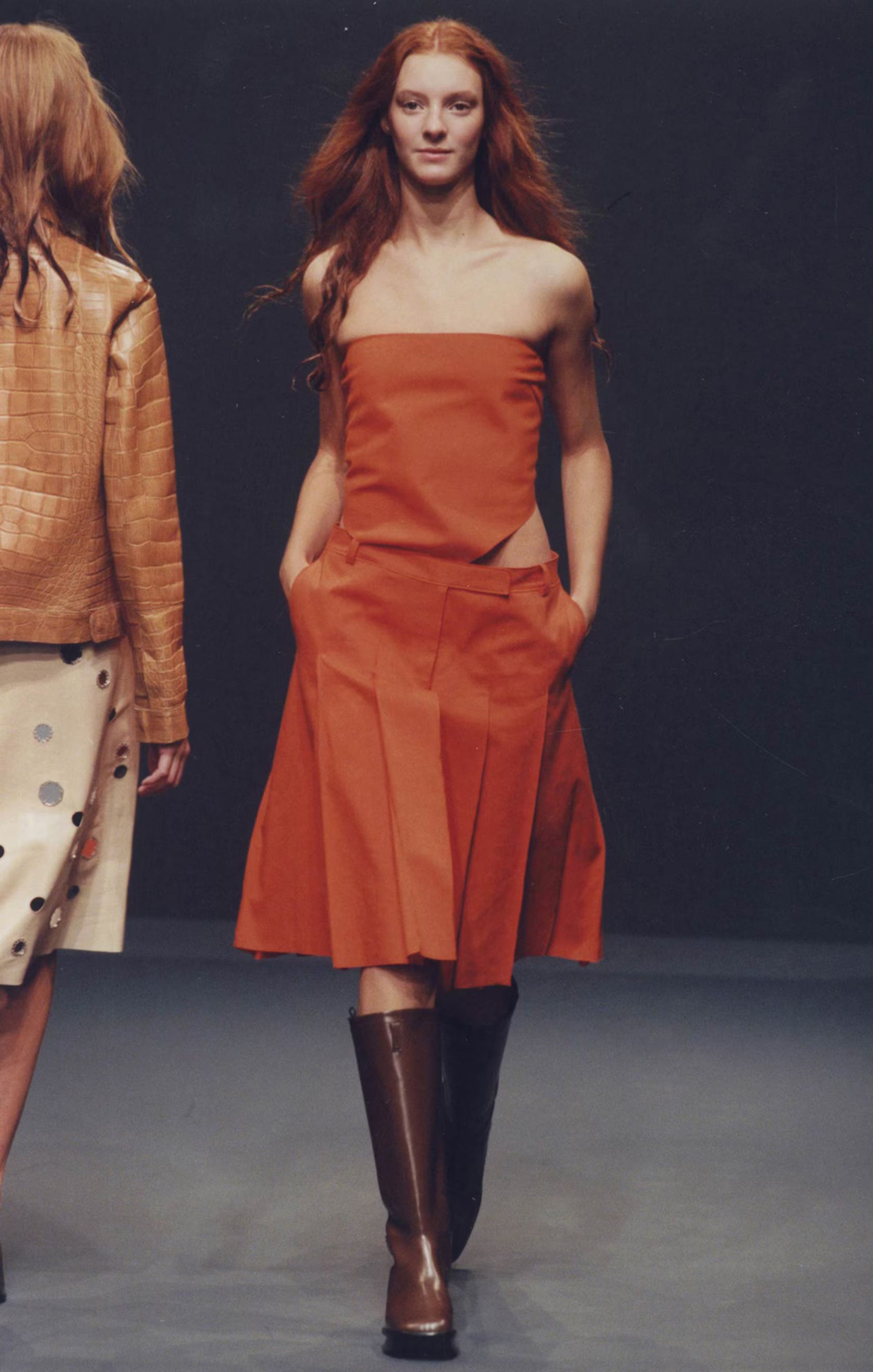
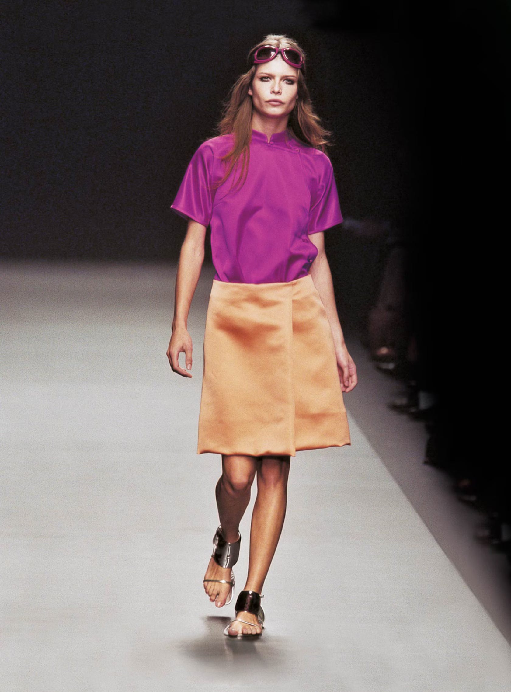
Orange
Prada’s orange is bright, but not in a sporty or juvenile way. It’s more like a poppy, almost traffic-cone orange: sharp and direct. When it appears in a collection, it feels like a jolt of energy. It’s often used sparingly, which makes it feel even more impactful.
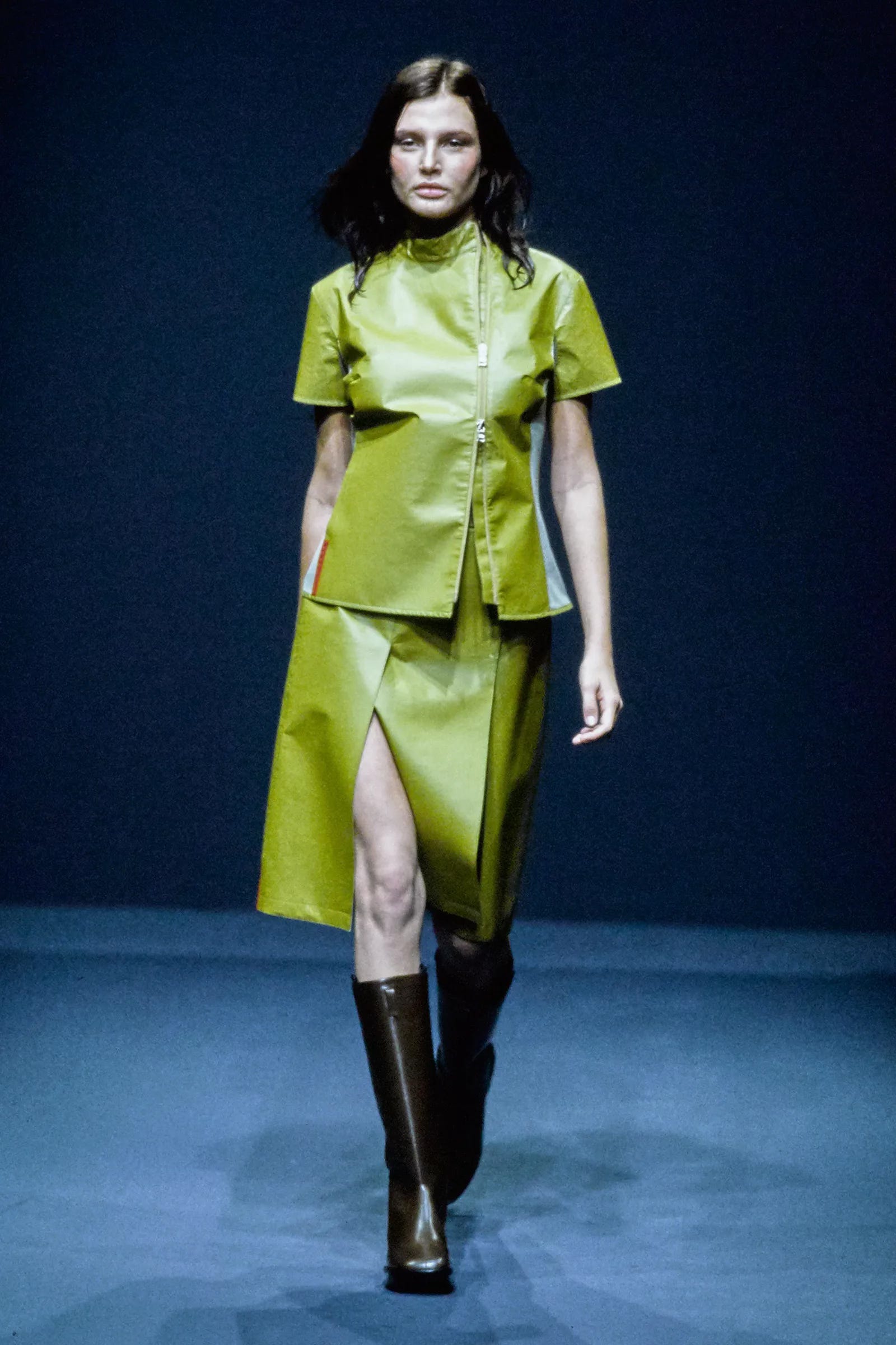
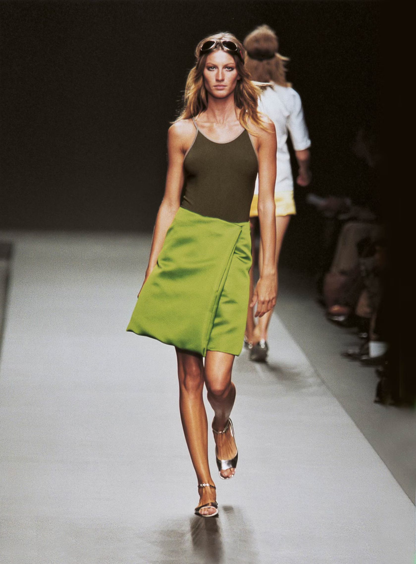
Acid / Kelly Green
There’s also a slightly acidic, almost neon-leaning Kelly green that pops up in different collections. It’s bold, but somehow still grounded. Maybe it’s the fabrics, or perhaps the silhouettes, but it never feels cartoonish. Instead it reads as confident, graphic, and very Prada.
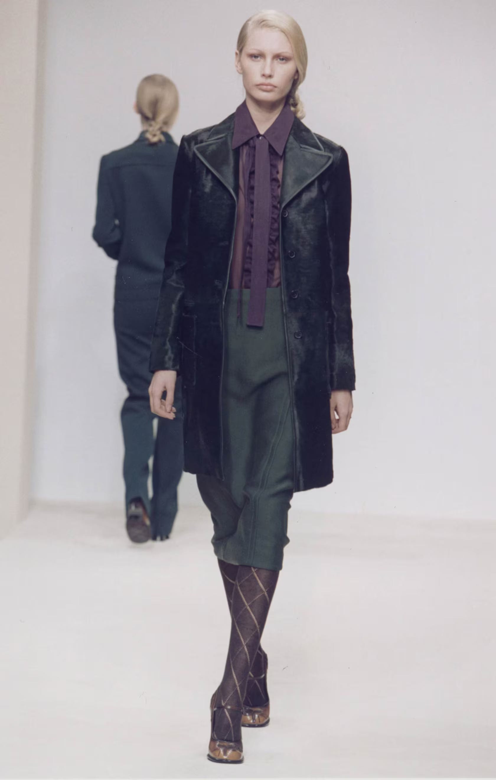
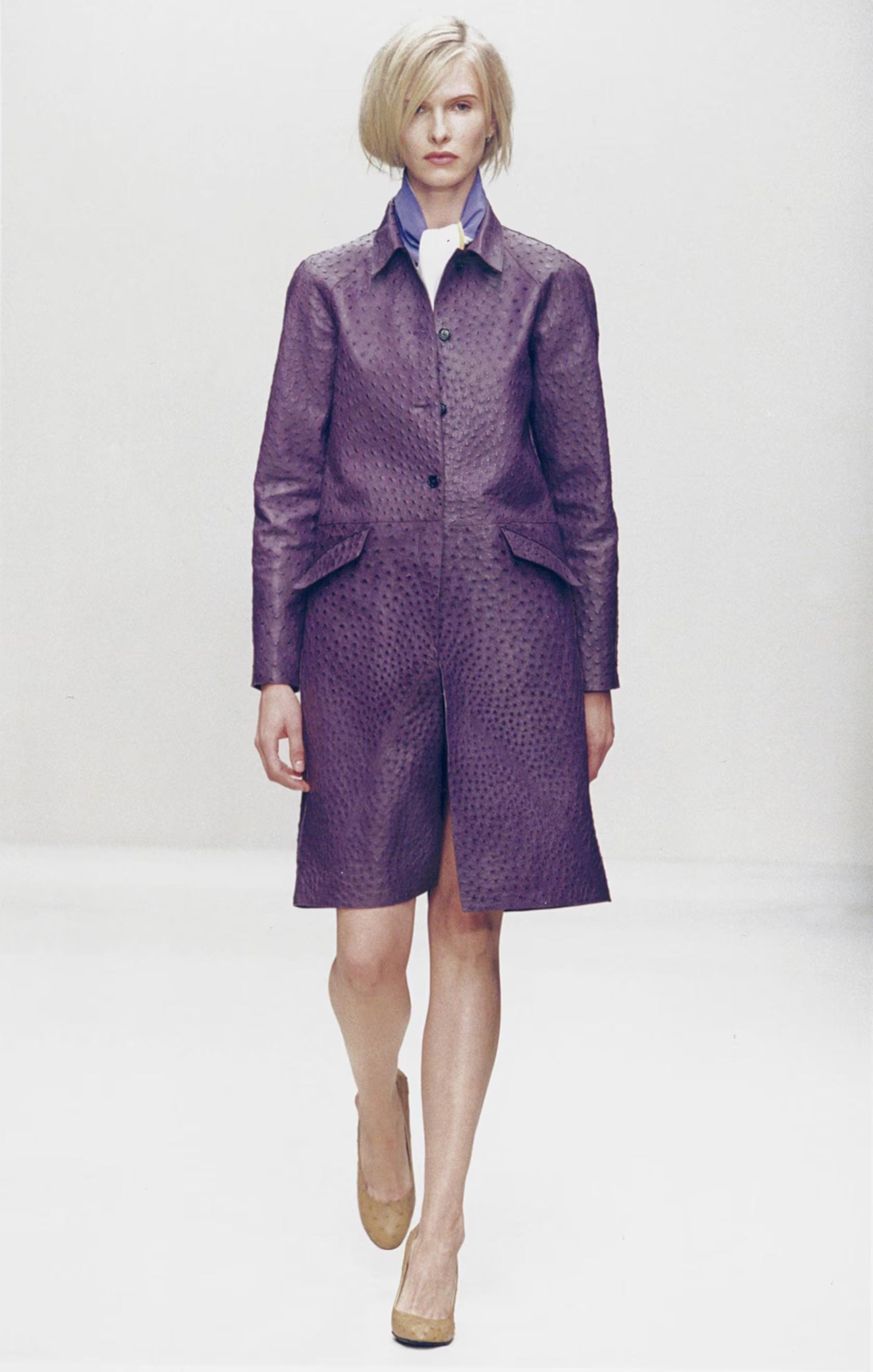
Deep Purple
Prada’s purples are usually deep, almost bruised. They’re rich without being regal, and read more introspective than luxurious. On a coat or a knit, they feel moody and intellectual.
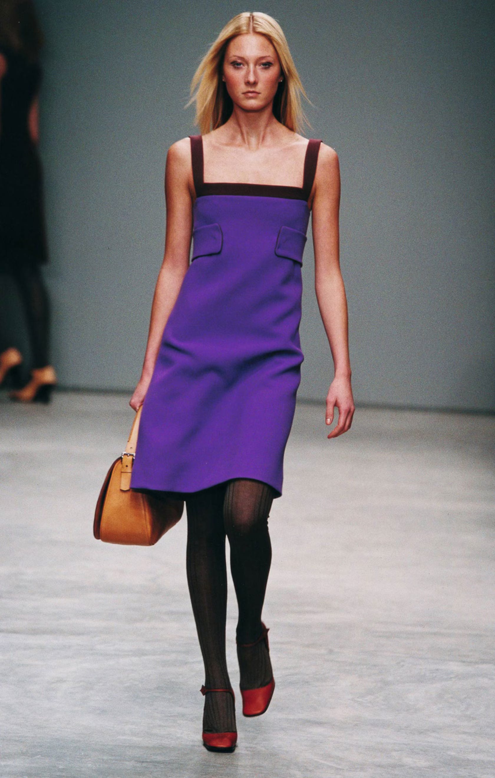
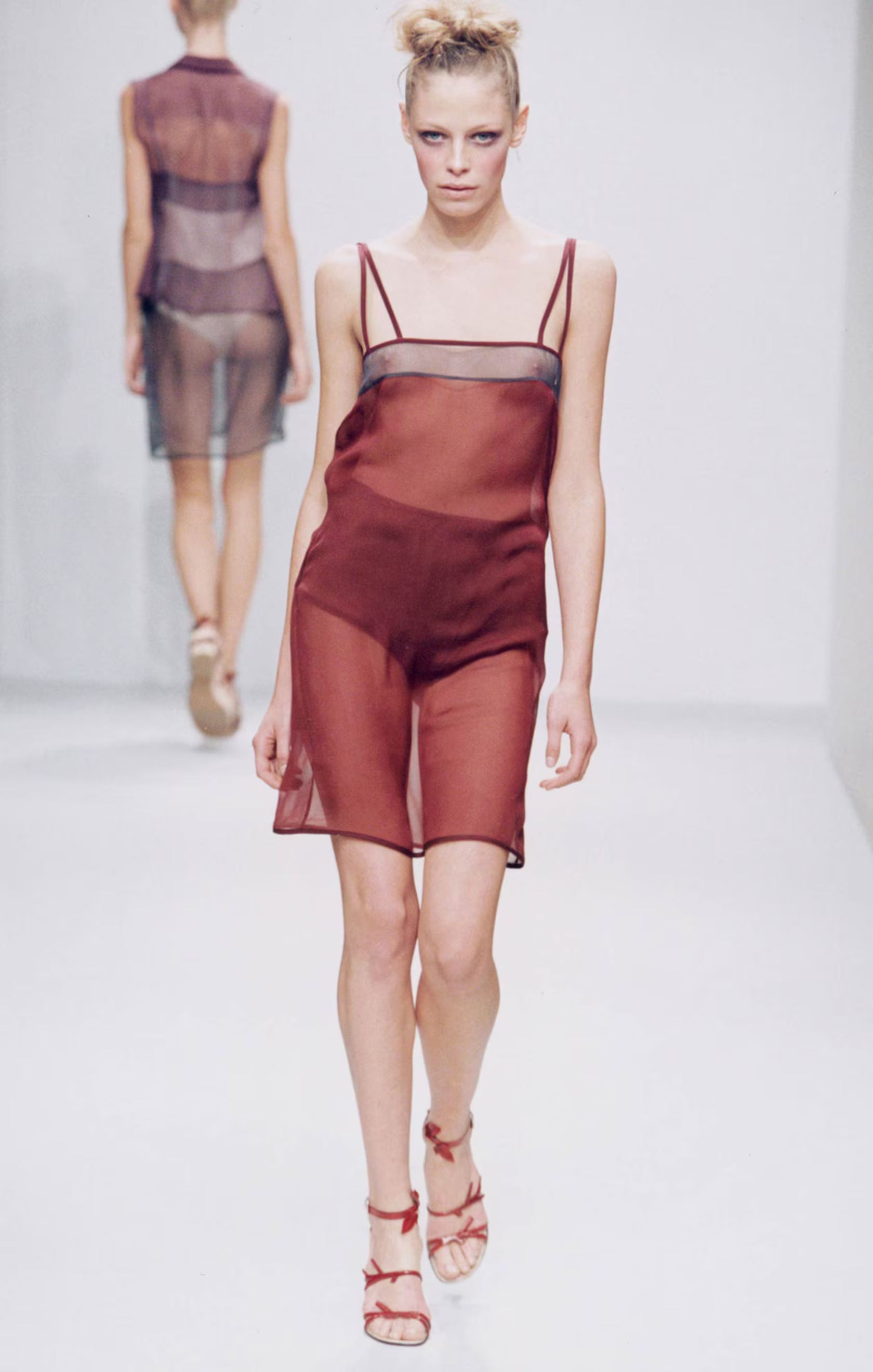
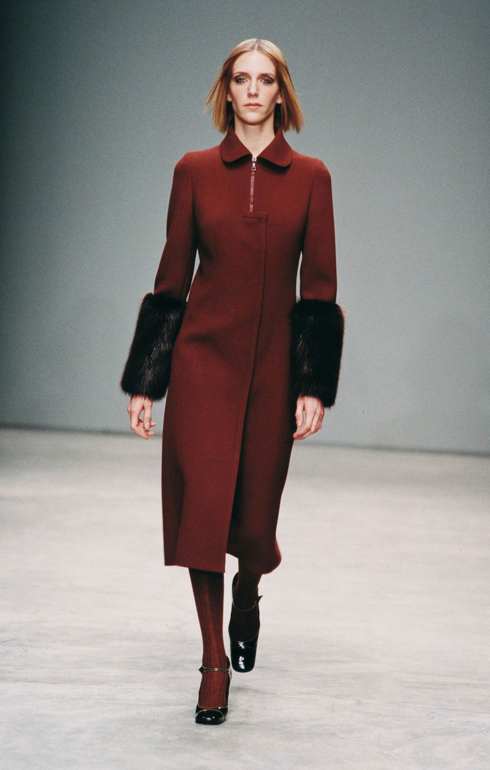
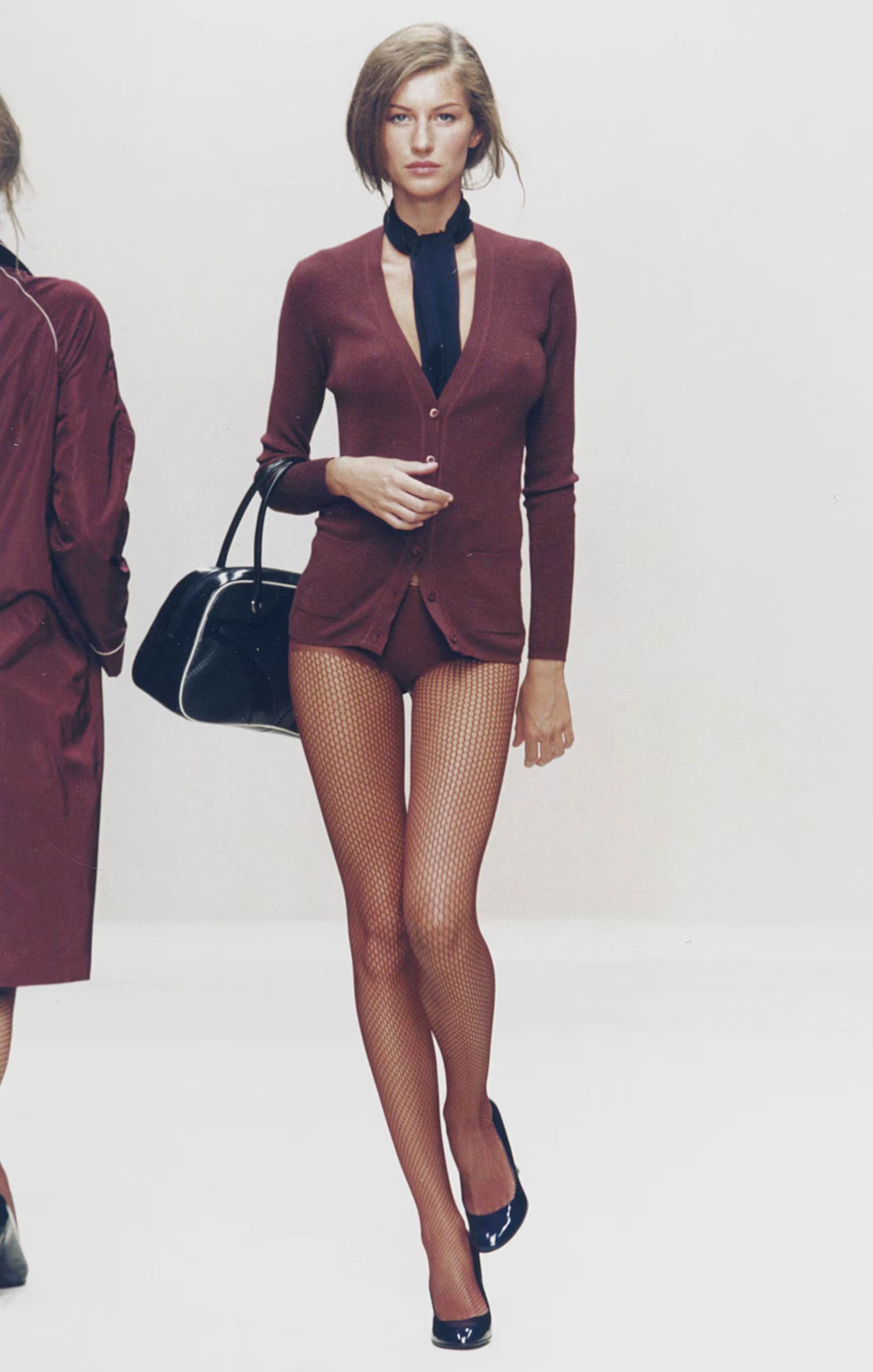
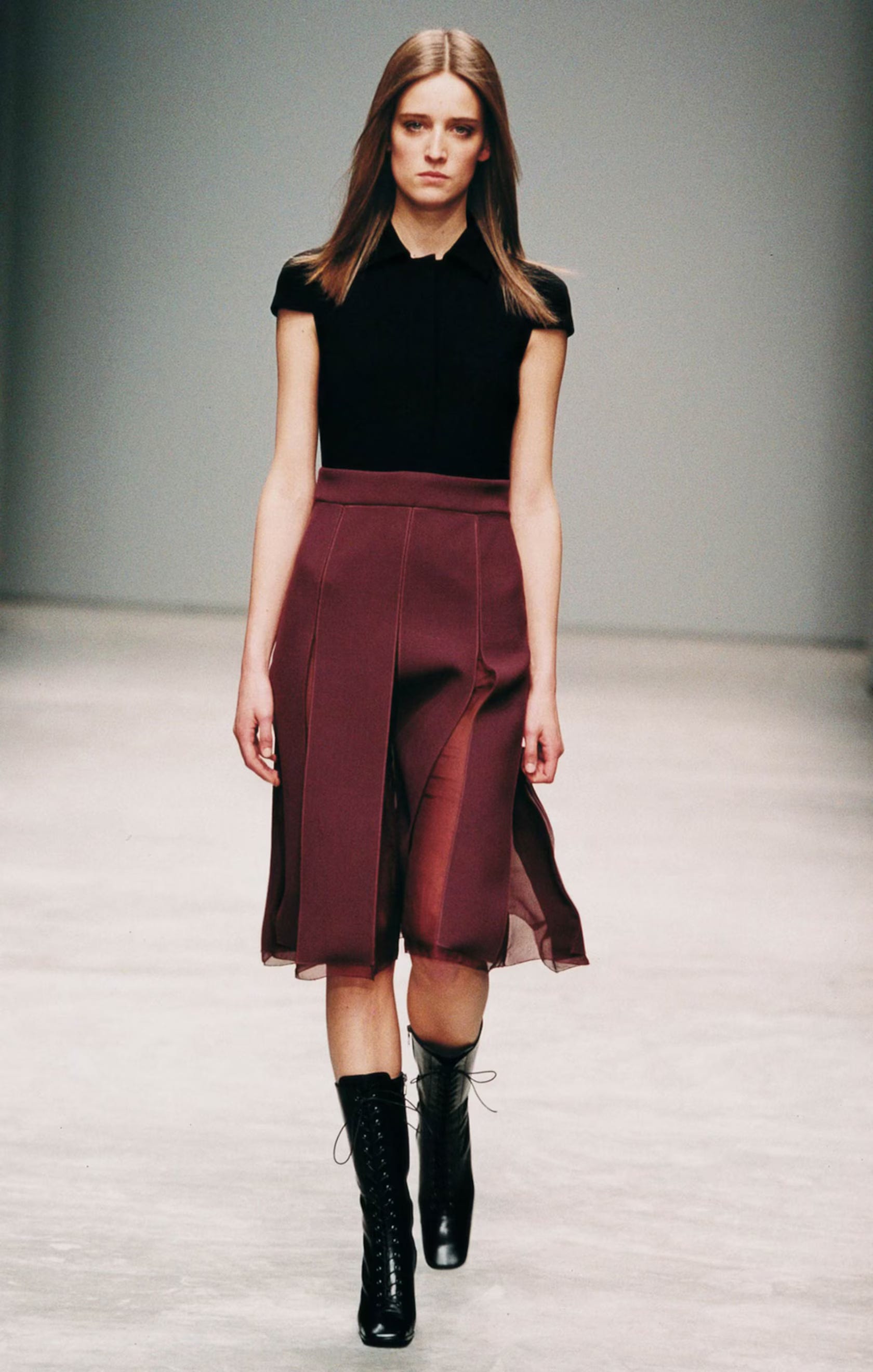
Burgundy Red
The reds often lean toward burgundy: slightly brown, slightly wine-stained, very autumnal. It’s not a flashy, fire-engine red. It’s more grown-up and restrained. Showing up on skirts, blouses and leather pieces, it always feels sophisticated in a very understated way.
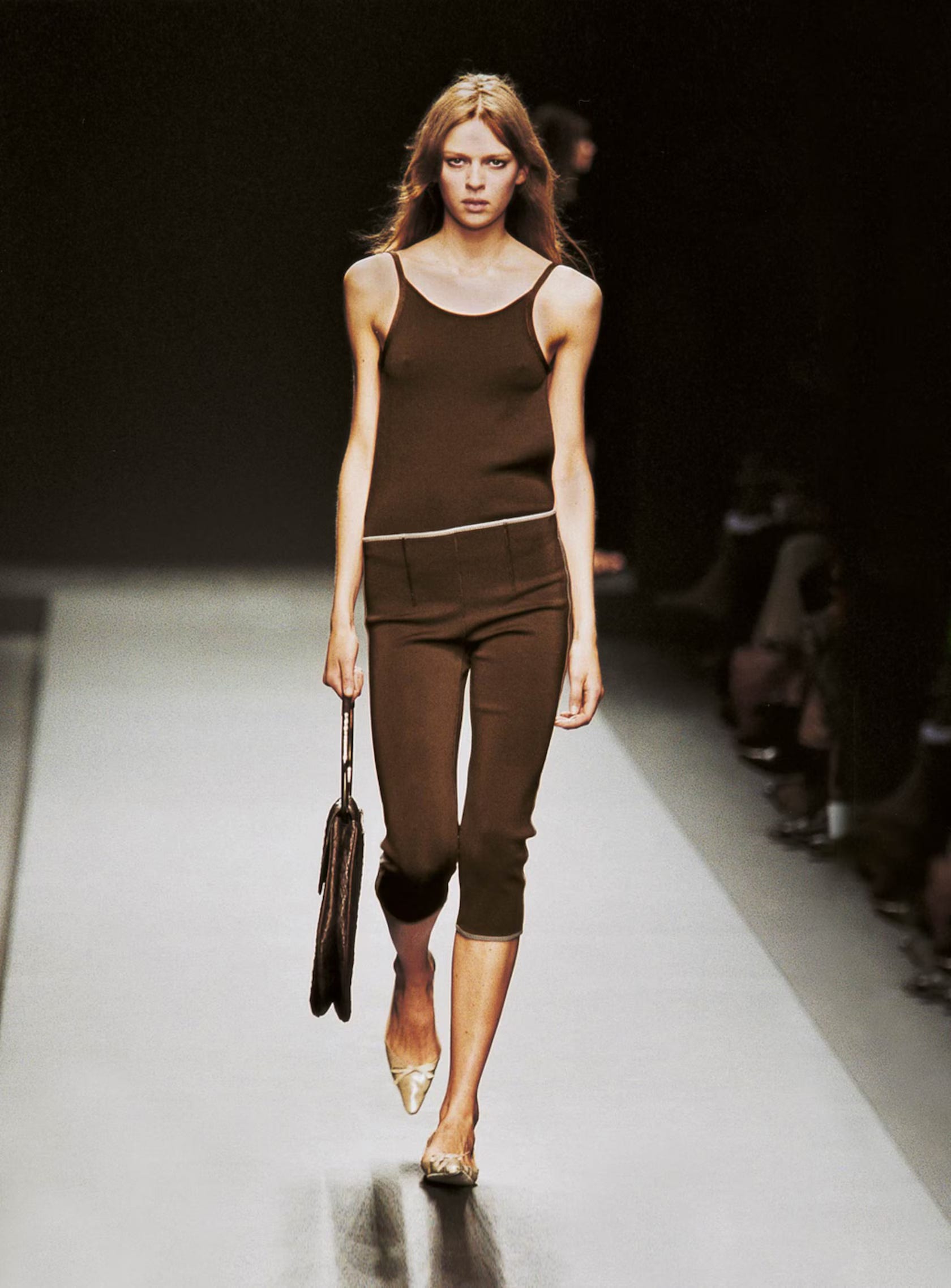
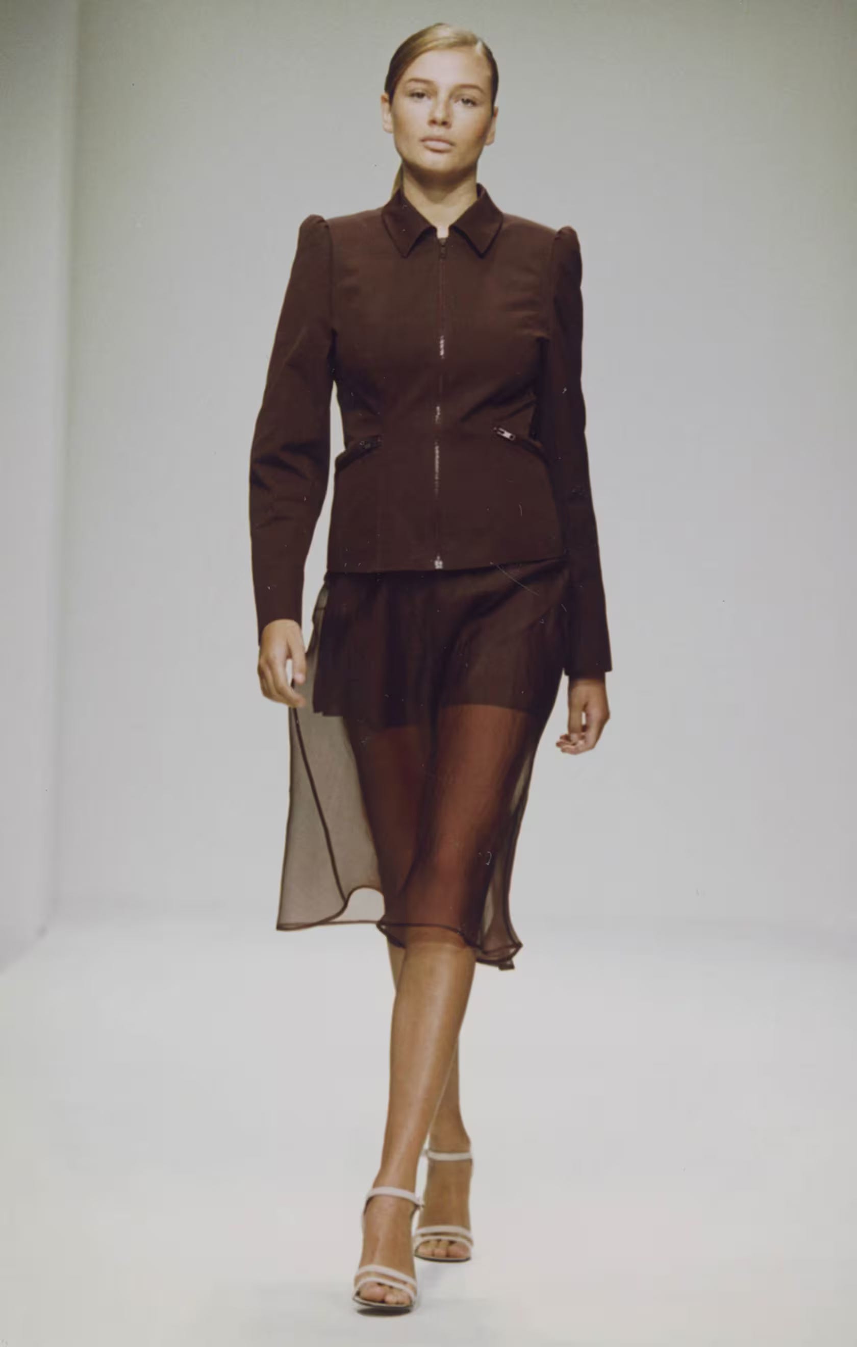
Deep Brown
Then there’s Prada brown— deep, chocolatey, sometimes almost muddy. It’s one of those colors that, on paper, might sound dull, but in practice feels incredibly chic. On leather, on wool, on nylon, it reads as warm, grounded, and quietly luxurious.
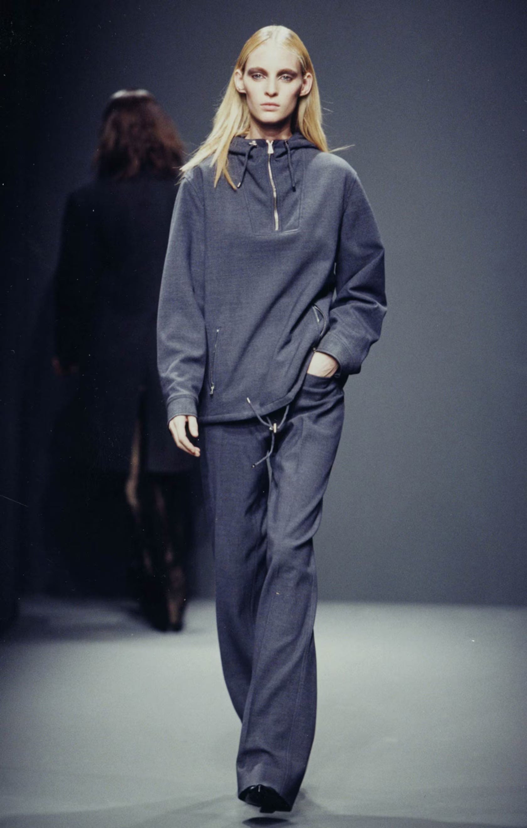
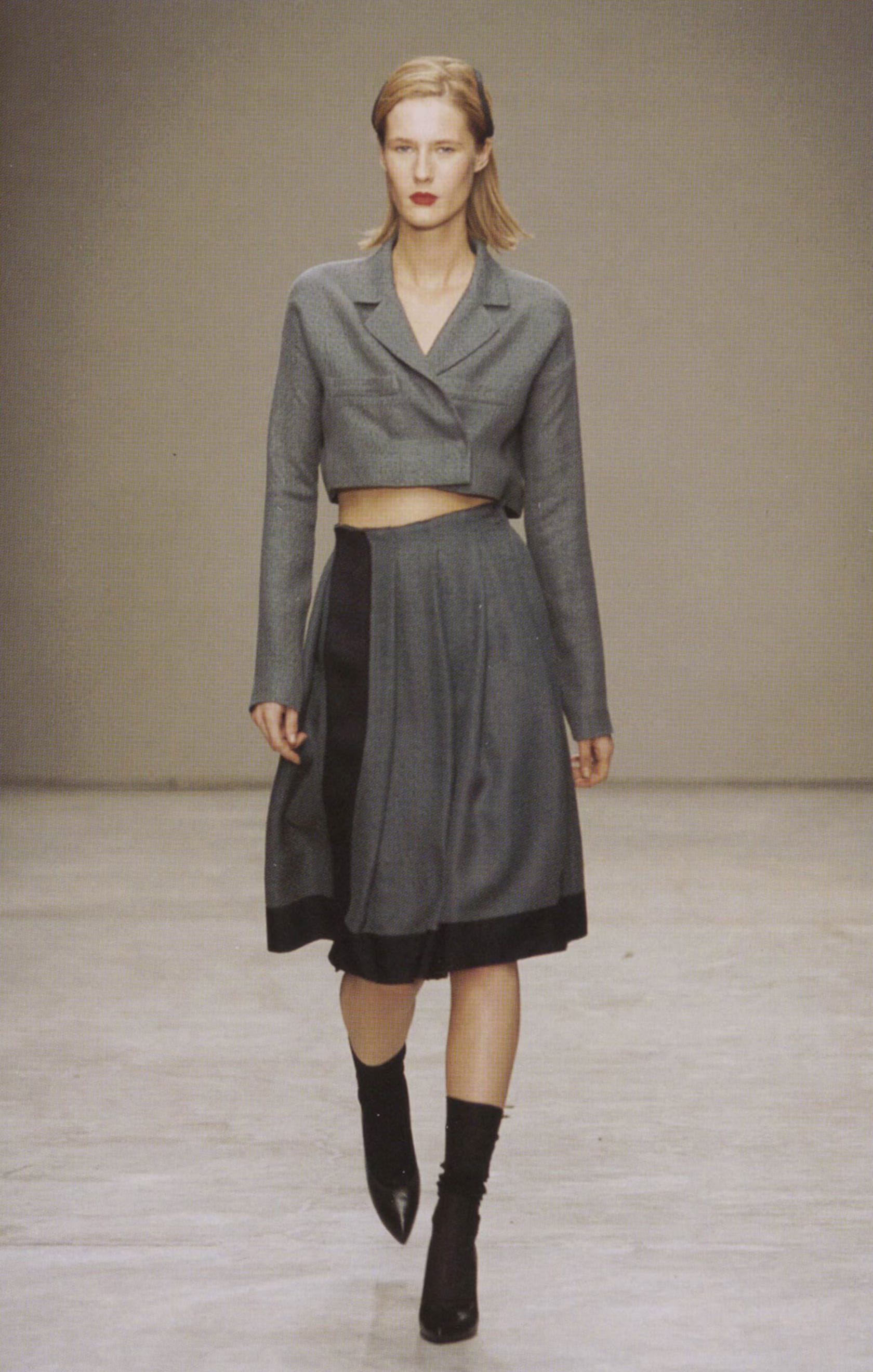
Gray
Prada’s charcoal gray is almost academic. It feels like uniforms, office carpeting, graphite, steel filing cabinets. It’s not a dramatic, inky gray, but softer, more lived-in and thoughtful. Miuccia uses it on tailoring, coats, and slightly awkward silhouettes, and it always feels very intentional and adult. It’s pragmatic but never boring.
What I love most is that these colors are so identifiable. When I’m flipping through racks at a vintage or archive store, I typically don’t even have to check the tag. I’ll see a certain pale blue shirt with a structured collar, or a specific shade of grey in a nylon jacket, or a slightly awkward olive skirt, and just know: that’s Prada.
And the funny thing is, it’s all so unbranded. Unlike other design houses where you might see a monogram or a logo splashed across the entire piece, Prada doesn’t rely on that. You recognize it through color, fabric, silhouette, and proportion. It’s a brand identity built on instinct rather than signage.
There’s also that subtle thread of the “ugly” that runs through everything, the boxy shoes with flat, almost orthopedic platforms, uniform feeling skirts, military-inspired jackets, utilitarian fabrics. Things that, in another context, might feel masculine or even clunky. But Prada tailors them to the body in a way that feels unexpectedly feminine.
They were really among the first in the ’90s to push that kind of subversive femininity; the idea that something slightly wrong and tomboyish could actually be the most beautiful thing in the room. And that idea, more than anything, is why Prada has always felt like my favorite brand. It doesn’t just give you clothes. It gives you a different way of seeing yourself.
Always Close,
NFS